I recently went on vacation in Europe. When I visit a new place, I try to get a feel for the new environment by walking around everywhere. Things like the OK to cross icon always amuse me since they are different.
London has a ton of history (old buildings), but I found that it exceeded my expectations for modern accessibility. The signage throughout the subway and public areas (train stations, etc) was really easy to follow.
In the UK, cars drive on the left side of the road. This is the opposite from the US. This means people coming from the US have to look on the other side for oncoming traffic while crossing the street.
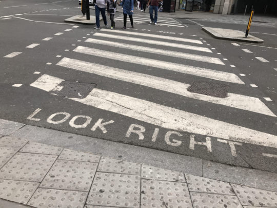
One particularly helpful affordance in London were these painted messages telling you which way to look:

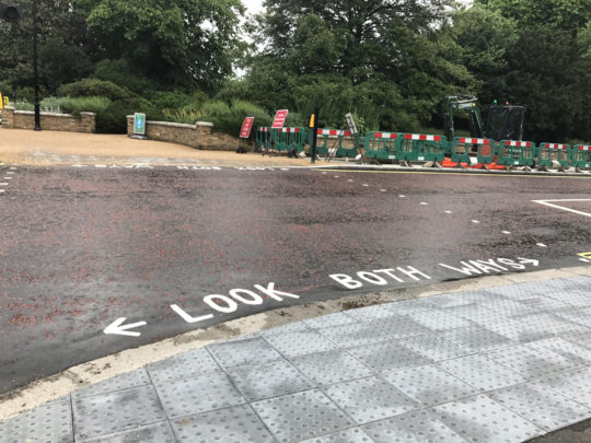
There’s also both ways:

I appreciated these messages since they didn’t have to paint them throughout London. But they did and it helped me make sure I was looking the correct way for traffic.