Tag Archives: UI

iOS Redeem App Code Mockup

New rule: if I have to google “how to [do something],” your UI needs improvement.

While redeeming an iOS app, I couldn’t figure out where to enter in the app code. I instinctively went to the Search section, as I know that has a text input section at the top:

iPhone App Store Search screen

No dice.

So as with everything in modern life, I went to Google for help. It turns out it’s at the bottom of the Featured screen.
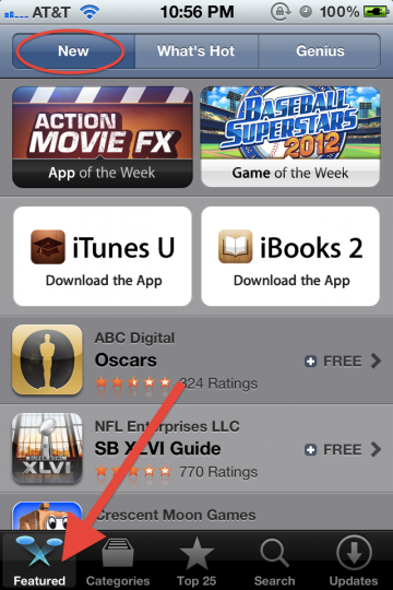
iPhone App Store Featured screen top

Scrolling down…
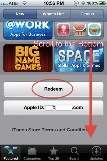
iPhone App Store Featured screen bottom

I find the Redeem button, and the rest is cake.

Without googling, I wouldn’t have stumbled upon Featured > New > page bottom to find the Redeem button.

I recognize that for most people, redeeming an app code is not a typical, common use case. That said, it should be somewhere logical. I’ve mocked up the Search screen with a Redeem button:

iPhone App Store Search screen mockup

This way, the user is able to associate entering in names of apps, keywords, or app codes in one convenient field.

The upside is an extremely easy to find Redeem button. A possible downside is that users will get led astray while searching for paid apps (by hunting for app codes instead of proceeding to checkout).
With Sites as Apps, Apps as Sites

From the one and only, Jeffrey Zeldman:

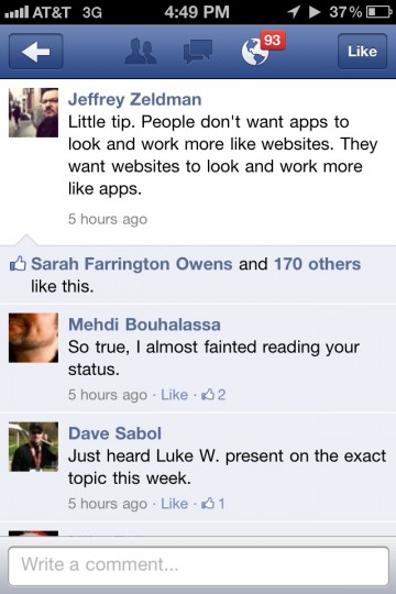
Zeldman Facebook iPhone screenshot

Zeldman says:

Little tip. People don’t want apps to look and work more like websites. They want websites to look and work more like apps.

My gut reaction to this insight is mixed.

On one hand, many new websites are in essence single serving apps. They have no more functionality than extremely niche smartphone apps. On the other hand, websites are visually distinct from apps. What I mean is, sites have been apps for a while now, but they don’t look exactly like smartphone apps. Even with responsive design, sites simply don’t use smartphone title bars and buttons.

Would the average user prefer simple smartphone app UI over tried and true website navigation metaphors? This could be the tradeoff between vertical-scrolling, hierarchical panes VS complex, kitchen sink pages.

Pandora’s Dated Browser UI and Poor Monetization

As an iPhone user, I’ve been using Pandora for a couple years now. The mobile user interface (UI) works well.

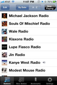
Pandora iPhone UI

In this iPhone screenshot, we can see that the Kanye West station is currently playing. We can easily change stations by scrolling up/down and selecting a station. Adding or removing a station is intuitive. This is a solid, popular mobile application that makes great use of the environment.

My question is how come the desktop browser implementation is so poor? Perhaps they want you to use Pandora One? I don’t hit 40 hours a month and don’t need to pay for ad-subsidized radio.

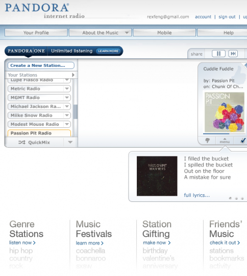
Pandora browser UI

The current implementation works, but that’s like saying the DMV works. Don’t get me wrong, Pandora is a great service. If they spent time improving their free browser application, they could significantly improve the usability and monetization.

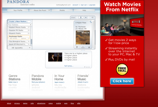
Pandora browser UI with Ad

Their current model is to frame the audio player with rotating ads, which is a perfectly fine business model. What is not acceptable is how little of the screen is used. It’s one thing to have a simple application with simple controls. It’s another to have a simple application with poor controls.

The audio player takes up a ballpark of 600 x 300 (w x h) pixels. It’s debatable whether your site should have a minimum width of 800 or 1024 pixels. It’s inefficient to only use 600 x 300 for your audio player and force your users to scroll up and down within the tiny box of radio stations.

I wanted to make the point that Pandora should allow you to flag songs into a wishlist for easy purchase later. Apparently this exists as their bookmark feature. After reading the FAQ, I’m unable to access my bookmarks or my profile. This is because Google Chrome blocks new windows by default. In this case, I’m siding with Chrome, because there is no reason that Pandora has to open a new window/tab so I can view my bookmarks. How about using some of that screen real estate, outside of the 600 x 300, to display page elements. Crazy right?

Pandora is a great, free service that works. They could improve their monetization by explaining bookmarks and improving their UI. Their browser conversion rate for song purchases would be significantly higher with a better browser UI.

Gmail’s New Select All Interface

OK, so this is pretty clever. Clever enough that I’m posting about it Friday night after work when I could be out doing things in the city.

Previous E-mail Options in Firefox

As the caption reads, this is a screenshot for Gmail in Firefox under the older interface. In order to select all e-mails or certain e-mails, you can click on “All” or another text option.

Standard Select All Check box

This is what you normally see around applications and websites to select all. It’s an accepted convention, so regular users know that by clicking on the top check box, all check boxes in the list will be selected.

New E-Mail Options in Chrome

This is what the current e-mail options area looks like. Sorry for using a Firefox screenshot above and a Chrome screen for the new UI. The select all box looks familiar right? Wait, what’s that? There’s a drop down option next to the checkbox?!

New E-Mail Options in Chrome - After Drop Down is Clicked

This screenshot shows what happens when you click it. As I said, this is some clever stuff. It goes from the clunky, non-standard convention of clicking “All” to clicking the check box if you want all items in the list. This is a good thing as general users are accustomed to the convention of clicking the check box to select all options. That in itself is good enough. If power users want to select a specific subset (e.g. Unread, Starred, etc.), they can easily do so with the drop down option.

What are the pros and cons of this change?

Off the top of my head:

Pros

  • Adopts common Select All check box convention
  • Reduces UI footprint (pixel real estate)
  • Simplifies the UI by presenting less options up front
  • The ‘None’ option does not break convention since you can Unselect all by clicking the check box a second time

Cons

  • Power users now have to click twice when they only had to click once before. (Before they could simply click on ‘Unread’)