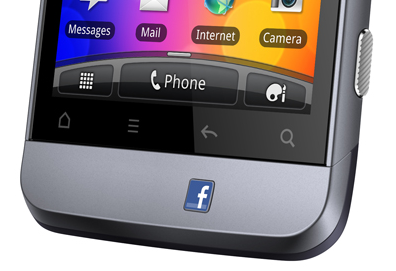
A dedicated button for Facebook on your phone? With super awkward placement?
While this Fb x Real Life mashup is unnecessary, I wanted to look at other examples of company logos on real life buttons. Most companies that produce hardware are content with having their logo printed onto a surface instead of a pushable button.
Note: images are used only to illustrate hardware buttons. Each logo is property of their respective owner.

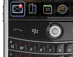
Blackberry has been doing this for some time. Note the natural location among the keys.
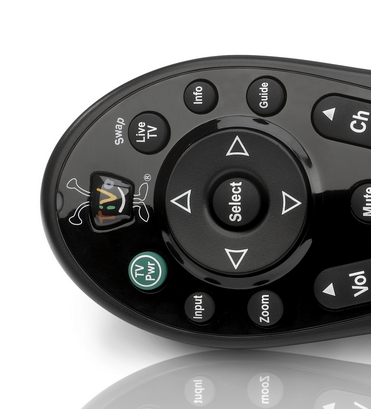
A natural category for buttons is remotes. Specifically TV remote controls.

TiVo has been doing this for a while with their quirky logo.

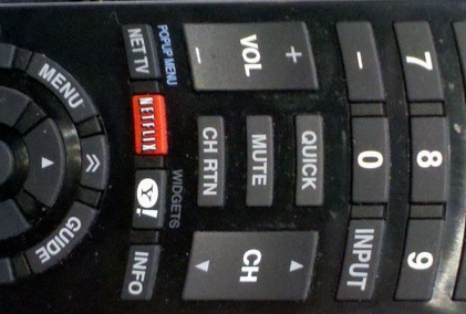
Netflix is rolling out their logo as more and more devices ship with an embedded Netflix app. Apparently, Yahoo got onto this remote as a bonus.
Another category with branded buttons is video game consoles. Their controllers have gained logo buttons with the current generation of hardware.

The original Xbox had a giant logo, but it wasn’t one you could press. The Xbox 360 has a pushable logo for Xbox’s dashboard.

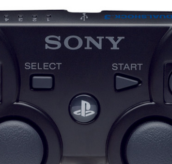
Playstation 3 getting its logo on.
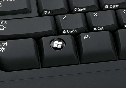
An easily overlooked category would be the keyboard. Countless keyboards have the Windows logo.

Here is an example of the ubiquitous Windows keyboards that exist. The Windows key is useful for certain shortcuts (Win + D for desktop), but a pain when you’re in the middle of a full screen game.

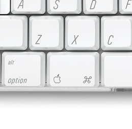
Some Mac keyboards have an Apple logo.
While the Facebook logo above is placed awkwardly for dramatic effect, most company logos are placed logically in a manner that consumers use every day.
