I am in the midst of wrapping up a new iOS app. Wrapping up an app includes so many things that are oftentimes overlooked when it comes to developing a mobile application. From App Store screenshots, intro video, and description text, there is a lot of room to do it well (or poorly).
My new app is a tip calculator, which is by no means a new idea. The reasons I decided to build a tip calculator was that I wanted 1.) to implement modern usability improvements and 2.) have an app that is visually attractive.
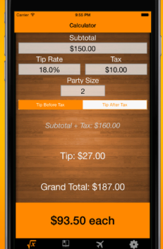
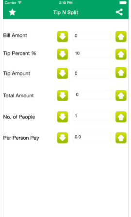
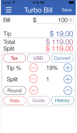
Looking at the App Store, most calculator apps adopt a heavily skeuomorphic style. There is nothing wrong with skeuomorphism (in the context of aiding usability), but I wanted to build a tip calculator that is sleek and does not resemble a calculator.
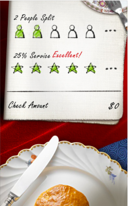
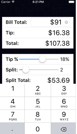
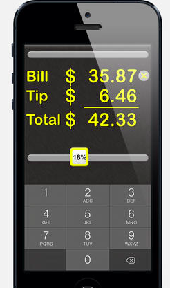
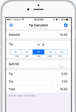
Below are screenshots from the current top search results for “tip calculator” in the App Store. They are all probably decent apps that work, but I’m posting them as a reference of what the current state of tip calculator apps looks like.
