As an iPhone user, I’ve been using Pandora for a couple years now. The mobile user interface (UI) works well.

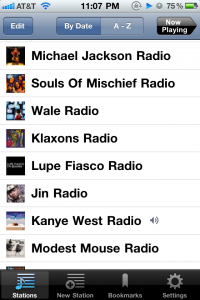
Pandora iPhone UI
In this iPhone screenshot, we can see that the Kanye West station is currently playing. We can easily change stations by scrolling up/down and selecting a station. Adding or removing a station is intuitive. This is a solid, popular mobile application that makes great use of the environment.
My question is how come the desktop browser implementation is so poor? Perhaps they want you to use Pandora One? I don’t hit 40 hours a month and don’t need to pay for ad-subsidized radio.

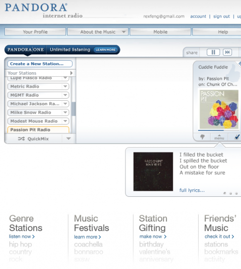
Pandora browser UI
The current implementation works, but that’s like saying the DMV works. Don’t get me wrong, Pandora is a great service. If they spent time improving their free browser application, they could significantly improve the usability and monetization.

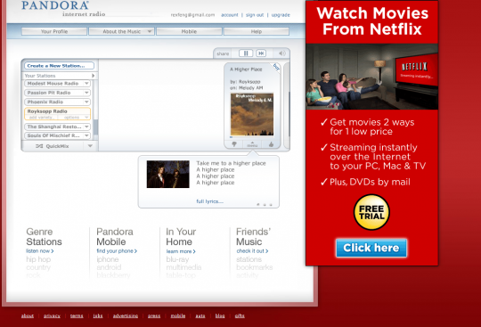
Pandora browser UI with Ad
Their current model is to frame the audio player with rotating ads, which is a perfectly fine business model. What is not acceptable is how little of the screen is used. It’s one thing to have a simple application with simple controls. It’s another to have a simple application with poor controls.
The audio player takes up a ballpark of 600 x 300 (w x h) pixels. It’s debatable whether your site should have a minimum width of 800 or 1024 pixels. It’s inefficient to only use 600 x 300 for your audio player and force your users to scroll up and down within the tiny box of radio stations.
I wanted to make the point that Pandora should allow you to flag songs into a wishlist for easy purchase later. Apparently this exists as their bookmark feature. After reading the FAQ, I’m unable to access my bookmarks or my profile. This is because Google Chrome blocks new windows by default. In this case, I’m siding with Chrome, because there is no reason that Pandora has to open a new window/tab so I can view my bookmarks. How about using some of that screen real estate, outside of the 600 x 300, to display page elements. Crazy right?
Pandora is a great, free service that works. They could improve their monetization by explaining bookmarks and improving their UI. Their browser conversion rate for song purchases would be significantly higher with a better browser UI.