Tag Archives: mac

New app alert (Copy Cleaner for macOS)

I’ve just released my first macOS app, a menu bar app. It’s called Copy Cleaner and it works in the background to remove tracking from URLs that are copied to your clipboard. The UX is very seamless since you use your mac normally, and common trackers (utm_source, etc) are removed automatically for you.

Working on a macOS app (on the mac App Store) was a nice diversion for me. I’m used to working in Xcode, but not on mac apps. Granted a menu bar app is different from a traditional desktop application that sits in your dock.

I built this app since it’s tackles something that I run into weekly. When I’m browsing iOS, JS, ruby, etc. newsletters, I end up clicking on many long URLs – filled with query trackers. By building this app, I don’t have to clean up my URLs manually any more. This app takes care of it.

Example

Copy this: https://www.example.com/?utm_source=newsletter&sfmc_activityid=abc12345-1234-1234-abcd-12345abcdefg&sfmc_id=123456789&utm_campaign=campaign-id-2020&utm_content=123456&utm_id=abcdefgh-1234-5678-9101-123a123abcde&utm_medium=email&utm_term=email%2campaign

You’ll paste this: https://www.example.com/

That’s it. The app works silently in the background. With Apple’s Clipboard and the app running on your mac, the URL cleaning works on both mac & iPhone.

Let me know if you have any questions. You can reach me on Twitter @rexfeng

P.S. – We’re on Product Hunt!

zsh PS1 setup

macOS Catalina uses zsh as the new default shell (instead of bash) in Terminal. This means that many people will be looking to re-setup their CLI with ~/.zshrc instead of ~/.bash_profile.

While customizing my .zshrc was a hassle, it was also an opportunity to clean up my profile and remove legacy settings.

Zsh offers an optional right side prompt, but I only used the left side prompt for now.

Here are some misc tips that I’ve found helpful:

  • For basic PS1 exports (time/date, current dir, user, etc), you can find examples here. Things like %D for the current date, %~ for the current directoy, and more.
  • In your PS1 export, you can start color formatting with %F{117} and end color formatting with %f. Replace 117 with whatever color your desire. You can find color codes here.
  • You can make your tab auto completion case insensitive (ignore case) by adding:
    zstyle ':completion:*' matcher-list 'm:{[:lower:]}={[:upper:]}'
    autoload -Uz compinit && compinit -i
  • You can show your current git branch with:
    autoload -Uz vcs_info
    precmd() { vcs_info }
    zstyle ':vcs_info:git:*' formats '(%b)'
    setopt prompt_subst

    Note: you also need to add $vcs_info_msg_0_ in your PS1 export line.

I’ve thought about creating a zshrc WYSIWYG tool, ala Halloween Bash, but I’ve shelved those plans since there’s only so much time in a day. With macOS Catalina inevitable for macOS users, more and more people are going to be looking for easy ~/.zshrc customization.

Using the MIYA Pro Mac Keyboard

I recently picked up the Ducky MIYA Pro Mac White LED 65% Dye Sub PBT Mechanical Keyboard. This seems to be a rebranded Varmilo keyboard as the cables are branded with Varmilo.

The form factor (tenkeyless) is nice and compact. The lack of numpad on the right gives me much more space for my mouse. As expected from a mechanical keyboard, the sound of the keys is noticeable.

I went with Cherry MX Brown switches. The keyboard typing feel is nice but requires more effort than a flat chiclet keyboard.

I went with this keyboard since I wanted different things: 1.) mac support, 2.) tenkeyless, and 3.) cherry mx browns.

The keyboard comes with an instruction manual in Chinese & English. I find the documentation to be lacking. You’d think a keyboard would be plug and play, but this keyboard is more complicated due to the top row sharing Number keys & Mac media/shortcut keys.

When I got my keyboard, it took me some time to figure out that Fn + A turns the keyboard into Mac mode. Fn + W would change it back to the default, Windows mode. I also had to activate “default mode” (it’s unclear to me what this means) by pressing Fn + D to be able to use the Number keys as numbers and have my Mac recognize the keyboard configuration.

Other things that confused me for a bit was the PgUp & PgDn alternating lights. Apparently one or the other never turns off? This is annoying for someone who values the little details and prefers certain aesthetics. I’ve read online that it lights up (one or the other) to indicate whether the keyboard’s top row is in Numbers mode or Media mode. To switch between the two, it’s Fn + PgUp for Numbers and Fn + PgDn for Media.

To use F1-F12, it’s Fn+PgDn, then Fn+F1 for F1 (and so on through F12).

As a software engineer, it took some time to figure out that Fn + Esc activates the backtick key (`).

Overall, the small form factor & hearty typing key feel are great. It’s unfortunate that a keyboard has a learning curve, but that’s the price to pay for a condensed layout where keys have double or triple duty.

My Aging MacBook Situation

My personal daily driver is a 2011 MacBook Air (MBA). I’ve shipped 6 iPhone apps from it. For a computer bought in 2011, I’m happy with how long it has lasted.

I am interested in buying a new MacBook Pro (MBP) to replace my aging MacBook Air, but I’m not sure what to do. The possible choices I see are:

1.) the current MBP (June 2017 version)
2.) wait ? months for an updated MBP (most likely a minor CPU refresh)
3.) a 2015 MBP version (older hardware style with IMHO better keyboard)

Reasons to upgrade sooner:
* Xcode runs poorly on my MBA. Storyboard, Simulator, and Playgrounds are barely usable.
* macOS Mojave will not run on my MacBook Air. It’s only a matter of time before I’m locked out of macOS & Xcode updates.
* Apple announced a Keyboard Service Program.
* As a professional software developer, I can easily justify 2-3 year upgrade cycles.
* My MBA is showing it’s age; the battery is virtually gone.

Reasons to upgrade later:
* My MBA is able to run Xcode 9 (current) and will hopefully run Xcode 10 GM.
* Buying after a new hardware refresh (minor CPU bump most likely) maximizes the currentness of the purchase. This may not be rational, but it’s a factor nonetheless.
* My iPhone app development is primarily dependent on iPhone hardware updates & Xcode, not my Mac.
* Indecision – since none of the current MBP options (2015 or 2017) are very appealing, I can wait it out.

Reasons that don’t make a difference:
* I don’t like typing on the current generation MBP keyboard, but the next significant MBP hardware refresh is probably a few years away (too long).
* USB-C – I’ve found a Multi-Port Adapter (dongle) that works for me.

Inconclusion

In retrospect, I should have bought a decently equipped 2015 MBP in 2015.

If Xcode 10 GM doesn’t work on my Mac, then I’ll be forced to buy a new Mac right away. Otherwise I will wait around hoping Apple decides to update the MBP.

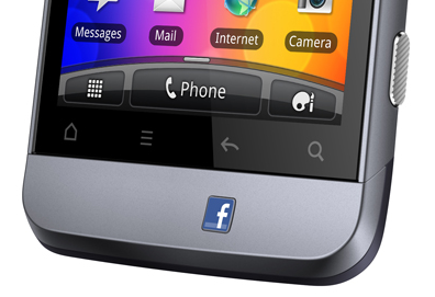
Real Life Facebook Button

A dedicated button for Facebook on your phone? With super awkward placement?

While this Fb x Real Life mashup is unnecessary, I wanted to look at other examples of company logos on real life buttons. Most companies that produce hardware are content with having their logo printed onto a surface instead of a pushable button.

Note: images are used only to illustrate hardware buttons. Each logo is property of their respective owner.

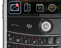
Blackberry has been doing this for some time. Note the natural location among the keys.

A natural category for buttons is remotes. Specifically TV remote controls.

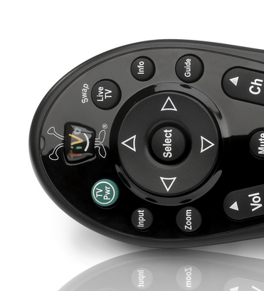
TiVo has been doing this for a while with their quirky logo.

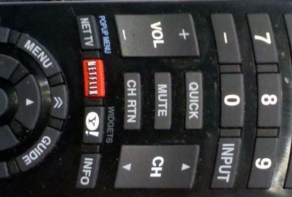
Netflix is rolling out their logo as more and more devices ship with an embedded Netflix app. Apparently, Yahoo got onto this remote as a bonus.

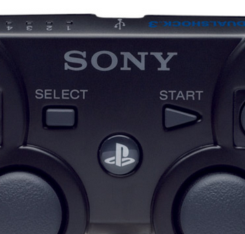
Another category with branded buttons is video game consoles. Their controllers have gained logo buttons with the current generation of hardware.

The original Xbox had a giant logo, but it wasn’t one you could press. The Xbox 360 has a pushable logo for Xbox’s dashboard.

Playstation 3 getting its logo on.

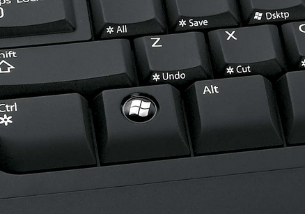
An easily overlooked category would be the keyboard. Countless keyboards have the Windows logo.

Here is an example of the ubiquitous Windows keyboards that exist. The Windows key is useful for certain shortcuts (Win + D for desktop), but a pain when you’re in the middle of a full screen game.

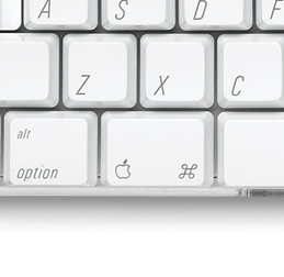
Some Mac keyboards have an Apple logo.

While the Facebook logo above is placed awkwardly for dramatic effect, most company logos are placed logically in a manner that consumers use every day.