Tag Archives: google reader

Former Google Reader PM on the Update

A take on the Google Reader update from former Google Reader Project Manager, Brian Shih:

Google released the previously announced set of changes around G+ integration and UI updates today, and boy is it a disaster.

He continues on visuals:

Taking the UI paradigm for G+ and mashing it onto Reader without any apparent regard for the underlying function is awful and it shows.

His take on Google+ integration:

Ok, before we get started – let me be very clear about one thing. I think integration with G+ should happen. Reader friends should be managed in the same place you manage G+, with the same metaphors (whether you think they’re flawed or not). Sharing should utilize the same infrastructure and plumbing that G+ does. I am not objecting to any of these things. Google has clearly made its bets with G+, and Reader should be part of those plans.

I find his views on the money. Google has every right to integrate Google+, but why do they trash the sharing functionality of Google Reader in the process? I understand that Google is trying to focus, even though it conflicts with their release-everything-as-a-beta-product DNA.

My discontent with the new Reader lies in the sharing workflow. It’s too many steps, as Brian explains:

But the new sharing flow around the +1 button has actually made it harder to share. Where you used to be able to click one button, or hit shift-s to one-click share to your audience, you now need to:

  1. Click +1 (no keyboard shortcuts for you)
  2. Click the text box that appears that says “Share to G+”
  3. Then choose your circle you want to share to (or let it default to public)
  4. Then click Share

Keep in mind that on top of requiring 3-4 times as many clicks, you also now must +1 a post publicly to share it, even if it’s shared to a private circle. That bears repeating. The next time you want to share some sexy halloween costumes with your private set of friends, you first must publicly +1 the post, which means it shows up on your profile, plus wherever the hell G+ decides to use +1 data. So much for building a network around privacy controls.

When Reader updated, I said the same message:

 Google, please separate the steps of explicitly approving content (+1) and sharing content among friends (sharing to Circles). Just place “Share to Circle(s)” between “+1″ and “Email” under each Google Reader content piece.

While I didn’t spell out the new workflow as Brian did, I was talking about the same issue. Why does Reader make you +1 content that you don’t necessarily want to +1 before you are allowed to share? Why does Reader make you take at least 3 steps now compared to 1 step (hitting shift+S) before?
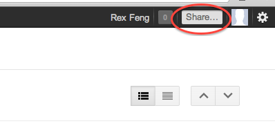
Luckily, there is a non-intuitive solution if you want to share Reader content to Google+ Circles. Brian shares:

If you click on the top right “Share…” field on the OneGoogle bar, you can bypass the +1 button. It’s just completely undiscoverable.

Ultimately, Google has every right to change Reader as it sees fit. Google provides Reader as a free product to users who derive some benefit. Google wants to align its products toward its bottom line, so they made Google+ the de facto sharing system of Reader. That said, users just want to 1.) read news & 2.) share content. It’s a shame that this latest update made #2 a bloated process.

(via googlesystem)
Google Reader +1 Change: This is all your fault Facebook

This post is all semantics and concerns Google Reader. Knowing fully well that most people have never heard of Google Reader (this guy uses it), allow me to rant.

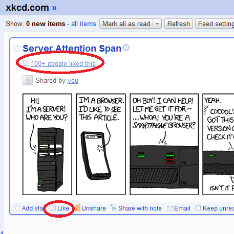
Once upon a time, Facebook rolled out the Like button. It was widely adopted across the web.

Facebook Like Button

Facebook defines the like button as:

The Like button lets a user share your content with friends on Facebook. When the user clicks the Like button on your site, a story appears in the user’s friends’ News Feed with a link back to your website.

In the definition, there is no explicit indication that the Facebook user approves/enjoys/etc. the content shared. But as anyone who speaks English will tell you, Liking something indicates that you find the content shared agreeable.

Not surprisingly, this has led to countless occasions where Facebook users have ‘Liked’ content that they do not (in plain English) like. See this bit about AT&T users on Facebook.

Updated Google Reader Screenshot

Today, Google rolled out their Google Reader update.

Before today’s update, you could Star, Like, Share, Share with note, Email, Keep Unread, and Tag Google Reader content. Those are each separate, independent actions:

Google Reader - Before Update Actions

Google defines sharing content as:

When you find interesting items on Reader, you can choose to share them on Google+ publicly, or with a certain circles or friends. You can also add a comment in the sharebox to your shared items. Your comment will show up along with the item you’ve recommended in the streams of those you’ve shared with.

Today, you can Star, +1, Email, Keep Unread, or Tag Google Reader content:

Google Reader - Updated Actions

I’m OK with this except for one workflow detail. Before you can share any Google Reader item, you need to first +1 it.

Google explains that +1 means:

+1 gets conversations going. Click the +1 button to give something your public stamp of approval. Then, if you want to share right away, add a comment and send it to the right circles on Google+.

Their Reader blog says:

The ability to +1 a feed item (replacing “Like”), with an option to then share it with your circles on Google+ (replacing “Share” and “Share with Note”).

The Google Reader update makes you give your “stamp of approval” on content before you can share it with friends. With content on the internet, there is plausibly content that you want to share (because you find it interesting) but do not approve of. For me, the Google Reader content that I Like (in the broadest sense of enjoying and approving of content) is a small subset of content that I Share. But interesting content (shared) & approved content (liked) don’t need to intersect.

Google has a superior system in place. By that, I mean that +1 & sharing to Circles are two distinct actions in Google+ VS the conflated Like action in Facebook. Google, please separate the steps of explicitly approving content (+1) and sharing content among friends (sharing to Circles). Just place “Share to Circle(s)” between “+1” and “Email” under each Google Reader content piece.


Update 11/10/11: Share has been added.

Google Reader API?

I’m surprised in this day and age where iOS only apps have their own API that a longstanding service like Google Reader doesn’t have an API. Apparently an API has been coming soon since 2005.

This is probably because idiots think RSS is dead. Not friendly to the mainstream user? Sure. Dead? No, not when every blog comes with a RSS feed.

Google Reader Like function screenshot

It would be neat to play around with the Like function in an API. For example, a blogger may want to reach out to those who RSS subscribe & like their posts. It would be harder to find a more engaged power user (given that users have to 1.) Use Google Reader, 2.) Add your feed, 3.) Read your posts, and 4.) Click like).

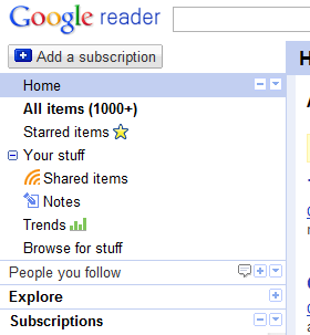
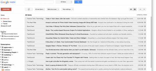
Google Reader navigation screenshot

The current Google Reader navigation is a poor mish-mash of social function bolted onto a best of breed RSS reader.

Consider what each of the items in the navigation section do:

  1. Home – A
  2. All Items – B
  3. Starred Items – C
  4. Your Stuff – D
  5. Shared Items – D
  6. Notes – D
  7. Trends – E
  8. Browse for stuff – A
  9. People you follow – F
  10. Explore – A
  11. Subscriptions – B

This can be boiled down to:

  1. A – Find new feeds.
  2. B – View unread feeds. Note that All Items is the default google.com/reader view, which works out well.
  3. C – Star items for later.
  4. D – Your shared items by granularity.
  5. E – Pretty stats page.
  6. F – Shared content by friends.

I would revamp the navigation to:

  1. A – Find new feeds. However Google wants to introduce you to new feeds, it can’t possibly take more than one page.
  2. D – Shared Items. I don’t distinguish between Shared Items and Notes. The actual distinction is that the former is via Google Reader sharing and the latter is via a bookmarklet type function.
  3. C – Starred Items. Keep this one as is.
  4. B,F – All Subscriptions. The “Subscriptions” text should show all subscriptions. Currently, the Subscriptions text reloads your subscriptions. Reloading subscriptions should be a refresh icon that everyone is familiar with. Then, I would make a folder under Subscriptions for People you follow items.

I wouldn’t mind losing the Trends (or stats) page since it caps out at 300K read items and 30 day trending.