… it turns out that lots and lots of stuff piled onto shelves or stacked in the middle of store aisles can coax a shopper to buy more.
After the recessionary years of shedding inventory and clearing store lanes for a cleaner, appealing look, retailers are reversing course and redesigning their spaces to add clutter.
This finding surprises me. Before this article, I assumed less clutter + more organization = always better for sales. Apparently, a cleaner look signals higher prices.
Retailers are putting their money where their mouths are by “adding items — and a little bit of mess — back to shelves.”
Does this retail insight hold for web design? Which site would you assume has higher prices based on the design/look?

Furniture Site A screenshot, logo redacted

Furniture Site B screenshot, logo redacted
The two websites shown above were picked for their state of web design (and not for the brand/company).
Looking past the world of retail furniture, does a website with clean design signal higher prices to you?

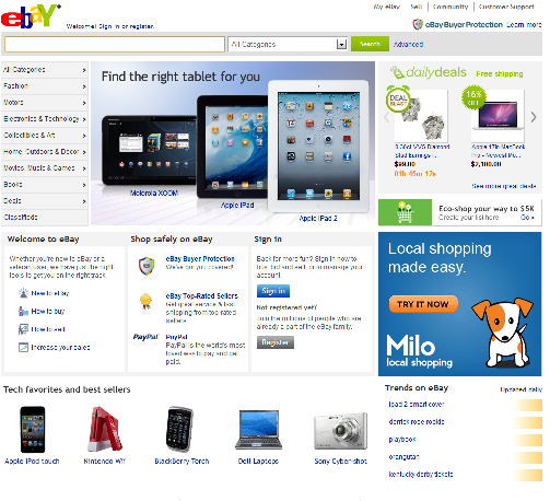
eBay homepage screenshot
eBay has a relatively modern design (whether it is clutter-free is up for debate). Does the homepage signal high or low prices to you?

GoDaddy homepage screenshot

Media Temple homepage screenshot
GoDaddy’s design is arguably more cluttered, and their prices are much lower for hosting than mt.
In a physical retail environment, clutter signals lower prices to consumers. On the internet, this may or may not hold true. Perhaps websites with cheaper prices skimp on the design bill? A website can offer affordable/cheap service and have great, clutter free design.
As a person interested in great user experiences, I’d like to believe that great design is a competitive advantage and not a trait that subconsciously signals higher prices.