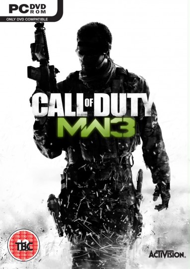
FPS games are not known for their creativity. Infinity Ward did a great job implementing perks & killstreaks that arguably improved or ruined the balance depending who you talk to. The box art of FPS blockbusters has not changed much.
For the record, I’ve enjoyed MW1 & MW2 extensively, but I’m not a fan of Treyarch’s CoD games.
Let’s take a look at the genre’s box art. The images below are copyright of Activision or EA, depending on the title.
Judging by the cover, the game looks pretty meh. Doesn’t matter though, since the CoD franchise sells gangbusters.
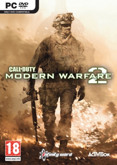
Call of Duy: MW2
This game has nukes, which is why everything is burning?

Call of Duty 4: MW
Judging by the cover again, nothing special. Gameplay is top-notch (G3 FTW)
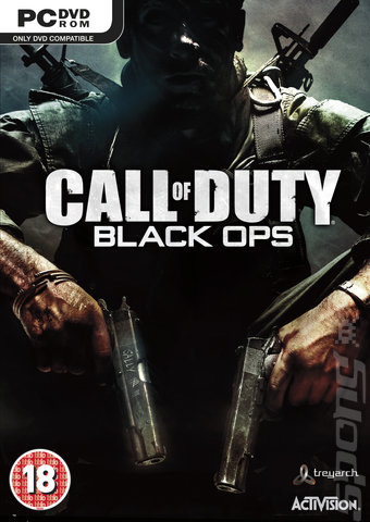
Call of Duty: Black Ops
Here’s a CoD: Blops cover thrown in for comparison. It breaks the mold by not showing a full body visible soldier silhouette

possible Battlefield 3 box art
Evokes a futuristic feel. Looks cleaner than MW3’s cover. I’m not sure why MW3 & BF3 are competing over which cover guy is taking more damage
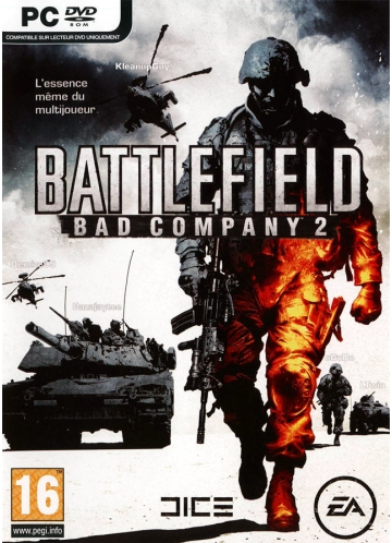
Battlefield Bad Company 2
Looks like the art designer had fun using clip art
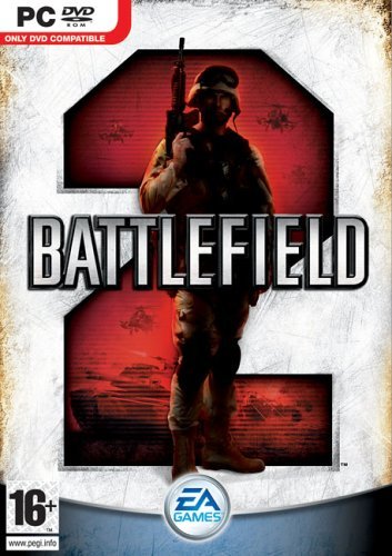
Battlefield 2
Glad to see this soldier is not on fire. While not the best art design ever, this cover is at least clean & the version number is easily identifiable
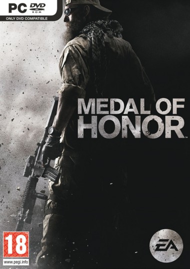
Medal of Honor
Based on a real life soldier, Cowboy, this grayscale design is subtle and powerful. Too bad the franchise reboot wasn’t very solid?
The games above fit in the war FPS realism category. Other games in the FPS genre compete on aspects such as classes (think TF2, Brink), arcade mechanics (Bulletstorm) and super powers (Crysis 2).
