Tag Archives: demo

Apple Vision Pro Demo Impressions

I tried out the Apple Vision Pro (AVP) hardware in an Apple store today. The ball was in Apple’s court. I really wanted to be impressed by the hardware and put me over the edge to pick one up and develop apps for it. I’ve released Day 1 apps for the Apple Watch & ARKit (iOS 11), and I believe in the future of AR for productivity.

Not Sharp

Unfortunately, when I wore the AVP, the content (text, images, etc.) was not razor sharp. I could use the device and navigate the OS without an issue, but I was expecting next-gen sharpness on the AVP displays.

My guess is I could try different distances (closer or further) from the screen to find the distance where all the content is sharp and crisp. Probably try different light seals. I couldn’t achieve the level of sharpness that I expect from any 2020 device (phone, HD monitor, etc).

Also, there was an opening at the bottom of my headset (towards my nose). I thought the light seals were supposed to block 360 degrees of light around the headset and not leave a small gap. That gap was normal per the Apple rep.

Demo

Apple did a great job with the demo. The demo was seated (smart) and focused on VR content, not passthrough use cases.

The OS (visionOS) was simple to use. Pinching to drag around or press buttons worked fine with hand gestures. When I tried to resize windows (bottom corners) or use two hands to pull apart, I ran into problems with certain apps where it wouldn’t work.

Content (2D vs 3D)

My imagined ideal use case would be having several large macOS screens in front of me to get work done. However, Apple marketing seems to be focused on entertainment (big TV in front of you) as their selling point.

The problem (in my opinion) is that the content was not great. Spatial content, shot on what I presumed are iPhone 15 Pro Maxes or AVPs, seemed low resolution to me. Enlarging an iPhone photo to fill up your entire room’s wall doesn’t work that well. It lacked detail. Even viewing a Panorama (shot on iPhone? not sure), the resolution was not great when viewed at such a large size.

Part of the demos included immersive environments. The environments were impressive since they were built natively for the device and 3D rendered. Viewing a photo from the moon environment was great since the nearby 3D rocks on the ground really sell the illusion.

I personally felt the other content fell apart. Spatial videos (shot with iPhone 15 PM?) were fun but it didn’t feel immersive to me since moving around lacked the convincing parallax experience you get from viewing things in your every day life.

While internet AVP users seem to enjoy viewing 2D movies on a giant, virtual screen, I think there is a huge opportunity for companies to build 3D immersive environments or games for users to be in (and interact with). Using the AVP’s state of the art hardware to view 2D images is like watching television without sound – a missed opportunity.

Takeaway

Despite the hardware issues (I suspect the light seal), I’d be interested in making AR apps for the AVP. Paying almost $4K to buy a dev kit and develop for Apple is a tough sell for an indie developer. I honestly think Apple should have a program for developers to borrow AVPs and build apps.
Pomodoro Pro WatchKit Architecture

My iOS app, Pomodoro Pro, is a constant work in progress. This post discusses how Apple Watch support was added to v1.1.0. Pomodoro Pro is a free, easy to use app for getting work done in continuous work & break cycles.

If you’ve looked into Apple Watch development, you’ve learned that the watch portion is an extension of your phone app. Your phone app is the brains of the operation, and your watch app relies on the phone app to do anything.

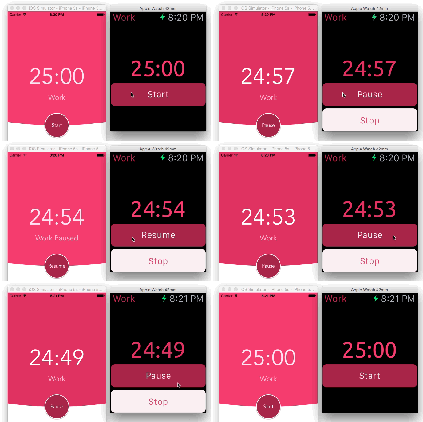
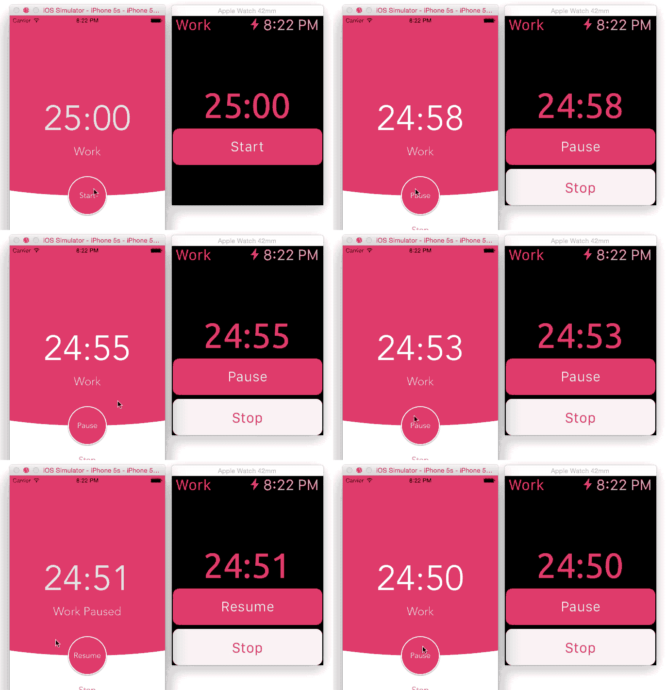
2 Way Event Binding Demo

From watch to phone

watch-final

From phone to watch

phone_8

App Lifecycle

With mobile development, it’s necessary to understand when a user will come into contact with your application. If the user comes across your application and starts using it when the visuals are incorrect, the user will lose confidence and not trust your application.

Working with Xcode and the watch simulator, my app has the following key lifecycle events:

  • watch starts up
  • watch resumes
  • watch actions (button presses) are reflected on both the watch & phone
  • phone actions (button presses) are reflected on both the phone & watch

Each of these events are essential for maintaining a consistent user experience that does not surprise the user.

Implementation

My implementation used MMWormhole for 2 way event binding. This means that the phone should know when a button was pressed on the watch and vice versa. Curtis Herbert has a great blog post on sharing data and events.

In order to have the phone app be responsible for the correct timer state, my phone app is responsible for returning a NSDictionary of the current timer properties. My watch app is able to get the NSDictionary and update the watch screen accordingly. It is important to note that my phone app is the ONLY source of the canonical current timer state. Trying to sync state between the phone and watch app would be a nightmare and a lot of work.

When the watch app starts, the watch app asks the phone for the current timer state (a NSDictionary) in order to set itself up correctly. When the watch app resumes from inactivity, it also asks the phone for the current timer state (a NSDictionary).

Using MMWormhole, I’m able to listen on events from the watch or the phone. When the user presses a button on the watch, the watch app passes a message to notify the phone, and the phone updates the timer state. Similarly, when the user presses a button on the phone, the phone app updates the timer state and notifies the watch app with the latest state.

Lessons Learned

  1. The phone app (not the watch app) is responsible for the correct state
  2. Use a Framework or shared classes (in File Inspector, add Target Membership) to DRY (don’t repeat yourself) out your codebase

Summary

With Pomodoro Pro, it was essential for a user to be able to start / pause / resume / stop the timer from either the phone app or the watch app. This required a way to manage the timer state (phone app) and have user actions occur on all screens (phone & watch).

In order to build a user friendly watch app, you should anticipate & identify where your app’s state and events come from. Make sure to account for those scenarios.

Pomodoro Pro v1.1.0 went live on 4/14/2015. Please let me know what you think @rexfeng

Mass Effect 3’s Multiplayer Unlock System is Addictive

Leave it to the doctors at BioWare to come up with a dangerously addictive game mechanic to unlock multiplayer items.

No, I’m not talking about the DLC that’s attached to everything.

In the past, you earned in game money and had to save up for what you really wanted.

In Resident Evil 4, you can talk to an ever-present merchant to buy/upgrade weapons:

Resident Evil 4 Store screenshot

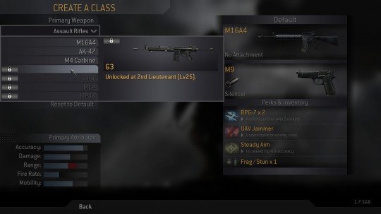
In CoD4: Modern Warfare, you automatically get unlocked weapons and perks upon leveling up:

CoD4 Weapon Unlock screenshot

Saving up money to buy what you need or level up bonuses are both fine systems. They’re predictable and fair.

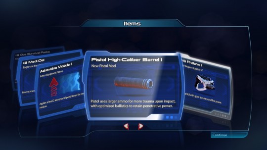
In the Mass Effect 3 demo, there are upgrade packs that you can/need to buy to get weapon unlocks.

The basic Recruit Pack (5K Credits) includes “a small chance for an Uncommon”:

Recruit Pack screenshot

But wait, there’s more! The luxurious Veteran Pack (20K Credits) includes “at least 1 Uncommon or better”:

Veteran Pack screenshot

You earn Credits by completing multiplayer missions.

As I understand it, the only way to unlock playable Race / Class combinations in the demo is to draw that specific Race / Class card from a Pack. This adds a lottery aspect to getting the character and weapon(s) that you seek. You can’t just save up credits, head to the store, and return home with the shiny new hotness. You have to get lucky cards from Packs you buy.

Some cards from a Recruit Pack:

Recruit Pack cards screenshot

Here’s some cards that I got from a Veteran Pack. Meh, where’s the Widow??

Veteran Pack cards screenshot

This brings out an ugly side of gaming. As if modern video gaming wasn’t already one big grindfest, the Mass Effect 3 demo random card system leads to even more grinding. Of course you always get “useful” cards like Medi-Gel and Missiles, but the let down remains.

“Why am I getting more SMG unlocks??”

Card packs in video games wasn’t invented by Mass Effect 3. There was even a card game video game. Mass Effect 3 does an incredible job integrating the feeling you get from grinding Diablo II (and soon to be D3) bosses into its multiplayer experience.

For better or worse, this gameplay mechanic extends the shelf life of the multiplayer experience in an extremely addictive way. “Just one more game! I need 3K more credits to get another pack…”