Tag Archives: app

New app alert (Copy Cleaner for macOS)

I’ve just released my first macOS app, a menu bar app. It’s called Copy Cleaner and it works in the background to remove tracking from URLs that are copied to your clipboard. The UX is very seamless since you use your mac normally, and common trackers (utm_source, etc) are removed automatically for you.

Working on a macOS app (on the mac App Store) was a nice diversion for me. I’m used to working in Xcode, but not on mac apps. Granted a menu bar app is different from a traditional desktop application that sits in your dock.

I built this app since it’s tackles something that I run into weekly. When I’m browsing iOS, JS, ruby, etc. newsletters, I end up clicking on many long URLs – filled with query trackers. By building this app, I don’t have to clean up my URLs manually any more. This app takes care of it.

Example

Copy this: https://www.example.com/?utm_source=newsletter&sfmc_activityid=abc12345-1234-1234-abcd-12345abcdefg&sfmc_id=123456789&utm_campaign=campaign-id-2020&utm_content=123456&utm_id=abcdefgh-1234-5678-9101-123a123abcde&utm_medium=email&utm_term=email%2campaign

You’ll paste this: https://www.example.com/

That’s it. The app works silently in the background. With Apple’s Clipboard and the app running on your mac, the URL cleaning works on both mac & iPhone.

Let me know if you have any questions. You can reach me on Twitter @rexfeng

P.S. – We’re on Product Hunt!

App Strategy

On the subject of doing app planning & strategy, I recently came across this post from Rob Caraway: http://robcaraway.com/blog/index.php/2017/02/12/how-i-overcame-crippling-perfectionism-and-made-200k-on-the-saturated-app-store/

Parts of it really resonated with me. He says:

Our strategy was basically “Let’s brainstorm ideas and ship massive features and hope people want them”.

That has been my naive strategy so far. Acting as my own ideal user.

Then he talks about validating a MVP:

  • using “Traffic, as indicated by Google Trends”
  • a landing page to capture e-mails
  • building a prototype in a week
  • validating the demand for the prototype

This all seems standard or obvious when you look at it. But I can say that in reality, I have various app ideas that I think are worth making. When it comes to pick the next one, my current process might as well be rolling dice with bad odds. It’s 1000% obvious, but building a neat app with good UX in 2017 doesn’t count for much. Having a solid marketing strategy in a validated niche is significantly more important than building the best app ever.

I’m currently at a point where I’ve released 3 iOS apps. One of them has done decently and the other two are not. I have to make a decision between prioritizing developing new features for my current apps or creating a new app. For the sake of learning new iOS tools (like the camera), it’s probably better for me to work on a new app. Hopefully I can properly validate my idea before I spend months building it this time.

How to open phone app from iMessage extension and pass data

This weekend, I spent some time digging into iOS 10 iMessage app extensions.

Creating an iMessage app or sticker pack is relatively easy. Here are a couple of resources for getting started: tutsplus and medium. Apple also has their own example iMessage app.

For a new iMessage only app, you can choose File > New > Project and either ‘Sticker Pack Application’ or ‘iMessage Application’ in Xcode. To add an iMessage extension to your existing containing phone app, you can use File > New > Target and either ‘Sticker Pack Extension’ or ‘iMessage Extension’.

I wanted to understand the current state of user workflow between the iOS (main/phone) app and the iMessage extension app. Apple has it’s work cut out for them. The iMessage App store is an awkward modal triggered from an individual iMessage conversation. Users seem to have trouble locating the store and managing iMessage apps, so apps are getting bad reviews.

The good news is that you can launch your phone app from the iMessage app.

From the iMessage extension app, you can use this (with your own AppName):

guard let url: URL = URL(string: "AppName://?myParam=myValue") else { return }

self.extensionContext?.open(url, completionHandler: { (success: Bool) in
 
 })

Calling the above code will open the phone app. One issue I ran into (under the extension scheme) is that the phone app will crash in the simulator when opened this way. Xcode shows a SIGKILL since the iMessage app connected to Xcode is quit while the phone app is being opened. This appears to only be a simulator issue.

You can access the URL params in your phone app’s App Delegate:

    func application(_ app: UIApplication, open url: URL, options: [UIApplicationOpenURLOptionsKey : Any] = [:]) -> Bool {

        return true

    }

The bad news is that you cannot launch your iMessage app from your phone app. Apple must have been short on time, as their usual modus operandi is to launch headline features that are incomplete and hopefully iterate later if their business still cares. Radar(s) have been filed.

When asked, “Is it possible for my app to open the Messages app with my iMessage extension activated?” An Apple Staff member says, “There currently isn’t a way to do this.”

I think opening your iMessage app from your phone app would be an excellent, natural use case. User does something in the containing app, then they want to share that app’s state with a friend using iMessage. Why rely on the user going to Messages, finding your iMessage app in the correct convo, and then recreating app state to send it over?

So to recap, iMessage apps have a lot of potential as they are living apps within iMessages. They can communicate with their containing app. But I have reservations about the UX, including discoverability.

Tip Solver launches

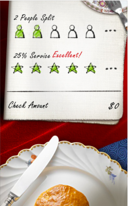
This week, my future-inspired tip calc, Tip Solver, launched on the App Store. Not only does it help you calculate you tip, it also helps you solve for how much you are really tipping.

3

As a tip calc, it’s easy to use and hopefully sleek/easy on the eyes. A key feature of this tip calculator is that it allows you to solve for your tip %. When you adjust the total or tip, you can see how much you actually tipped right away. This comes in handy when you pay $100 instead of $95, and so on.

While it’s customary to go from top to bottom when looking a receipt (for the items ordered, tax, tip, and total lines), I felt that it was better to invert the direction (to use a bottom to top approach). The reason being that your thumbs are often better able to reach the bottom (not the top) of the device. I wanted the most common action (setting the bill amount) to be in the easy to reach thumb zone.

Please check out my app if you have a moment. It’s free (with ads) and works on iPhones & iPads. If you have any feedback, you can let me know at rexfeng@gmail.com

https://itunes.apple.com/us/app/tip-solver-premier-gratuity/id1130814051

iOS Tip Calculators

I am in the midst of wrapping up a new iOS app. Wrapping up an app includes so many things that are oftentimes overlooked when it comes to developing a mobile application. From App Store screenshots, intro video, and description text, there is a lot of room to do it well (or poorly).

My new app is a tip calculator, which is by no means a new idea. The reasons I decided to build a tip calculator was that I wanted 1.) to implement modern usability improvements and 2.) have an app that is visually attractive.

Looking at the App Store, most calculator apps adopt a heavily skeuomorphic style. There is nothing wrong with skeuomorphism (in the context of aiding usability), but I wanted to build a tip calculator that is sleek and does not resemble a calculator.

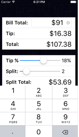
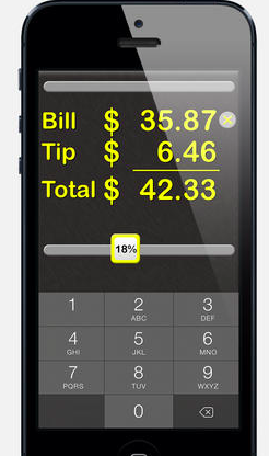
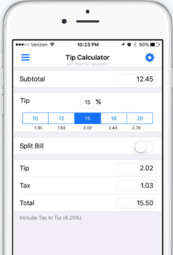
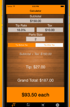
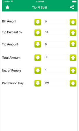
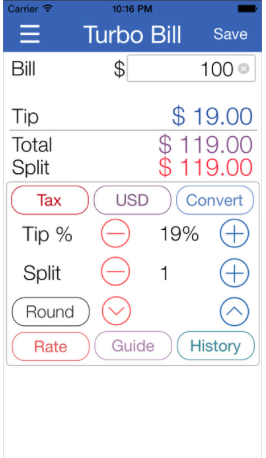
Below are screenshots from the current top search results for “tip calculator” in the App Store. They are all probably decent apps that work, but I’m posting them as a reference of what the current state of tip calculator apps looks like.

Screen Shot 2016-06-22 at 7.26.17 PM Screen Shot 2016-06-22 at 7.26.41 PM Screen Shot 2016-06-22 at 7.26.56 PM Screen Shot 2016-06-22 at 7.27.05 PM Screen Shot 2016-06-22 at 7.27.20 PM Screen Shot 2016-06-22 at 7.27.49 PM Screen Shot 2016-06-22 at 7.28.03 PM Screen Shot 2016-06-22 at 7.28.09 PM

iOS Redeem App Code Mockup

New rule: if I have to google “how to [do something],” your UI needs improvement.

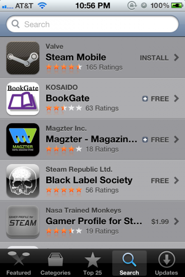
While redeeming an iOS app, I couldn’t figure out where to enter in the app code. I instinctively went to the Search section, as I know that has a text input section at the top:

iPhone App Store Search screen

No dice.

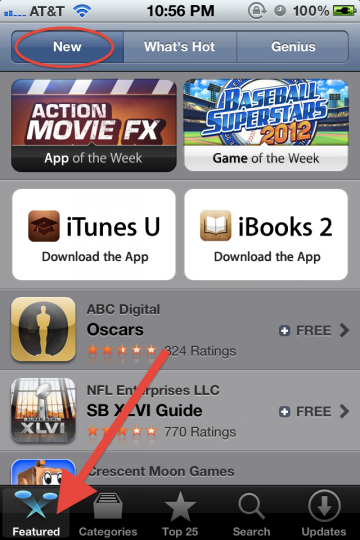
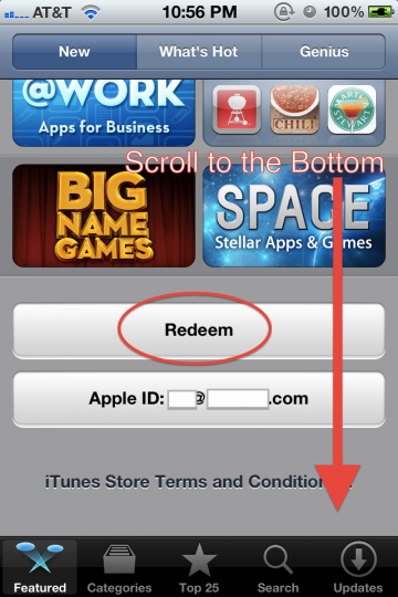
So as with everything in modern life, I went to Google for help. It turns out it’s at the bottom of the Featured screen.

iPhone App Store Featured screen top

Scrolling down…

iPhone App Store Featured screen bottom

I find the Redeem button, and the rest is cake.

Without googling, I wouldn’t have stumbled upon Featured > New > page bottom to find the Redeem button.

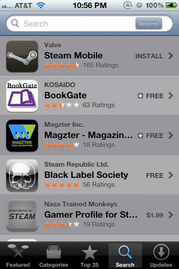
I recognize that for most people, redeeming an app code is not a typical, common use case. That said, it should be somewhere logical. I’ve mocked up the Search screen with a Redeem button:

iPhone App Store Search screen mockup

This way, the user is able to associate entering in names of apps, keywords, or app codes in one convenient field.

The upside is an extremely easy to find Redeem button. A possible downside is that users will get led astray while searching for paid apps (by hunting for app codes instead of proceeding to checkout).