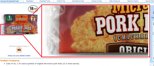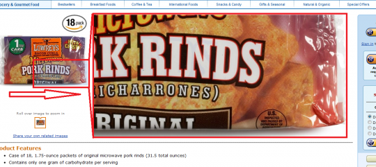
While Mousing Over Product Image
While surfing Amazon via slickdeals today, I noticed this updated product image zoom technique on Amazon. Not sure if this technique is necessary, but on the surface it seems a net improvement in utility for Amazon’s customers.

Before Mouse Over of Image
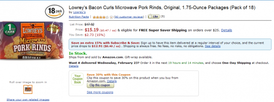
Before mousing over the product image (seen on the left), this product page looks like any other product page on Amazon.

The Zoomed Selector Range
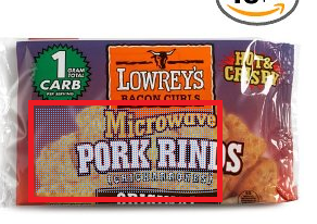
While you mouse over the product image, you see a blue dot texture indicating what part of the product image you are zooming into.

Mouse Over of Product Image
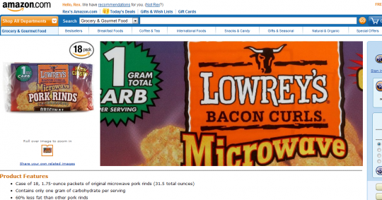
Mousing over the bottom left corner replaces the product description section with a corresponding bottom left product zoom.

Product Image Mouse Tracks to the Right
As you move your mouse to the right of the product image, you can see that the product zoom tracks accordingly.

Product Page without Mouse Over
Once your mouse leaves the product image on the left, the screen returns to normal. You can now see the product description again.
Regarding when this update was rolled out or what browsers this works in, I don’t have definitive answers. I noticed this product image zoom update today while using Chrome at the product page.
As for its conversion rate, I did not buy the product. Either their internal testing shows an increase in purchases with this rollout or I got put into a testing sample. I could see this product image zoom technique become useful for products with hard to read text (such as food ingredient labels).
