iOS Universal iPad Portrait Gotcha

I wanted to share a small tip that reinforces the necessity of on-device (non-simulator) testing.

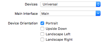
While finalizing my latest iOS app (universal for both iPhone & iPad), I found an issue through manual QA on an actual iPad. I had only left Portrait checked in the Project > General section of Xcode, but my app was somehow running in landscape mode on the iPad.

general

Confused as to why it was rendering in both landscape & portrait mode on my iPad, I found a handy stack overflow post.

For one reason or another, you have to update your Info.plist to only specify portrait settings for iPads. Below is my Info.plist after I updated it to only target Portrait mode.

info_plist

It’s confusing as to why the Project General section’s Device Orientation is not sufficient to force only Portrait orientations and you have to also update the Info.plist.

Through simulator testing, it’s not likely that I would have caught onto this portrait vs landscape issue. I relied mostly on my primary iPhone and copious amounts of simulator testing for the other iOS universal devices.

For the highest level of quality control, you would need an iPhone 4s, iPhone 5, iPhone 6, iPhone 6+, iPad, and iPad Pro. That’s a lot of devices and I certainly don’t have all of those. Sidenote: if you do have all those devices, you would also be positioned to record App Preview videos for all devices natively (AKA lots of work).

Tip Solver launches

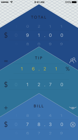
This week, my future-inspired tip calc, Tip Solver, launched on the App Store. Not only does it help you calculate you tip, it also helps you solve for how much you are really tipping.

3

As a tip calc, it’s easy to use and hopefully sleek/easy on the eyes. A key feature of this tip calculator is that it allows you to solve for your tip %. When you adjust the total or tip, you can see how much you actually tipped right away. This comes in handy when you pay $100 instead of $95, and so on.

While it’s customary to go from top to bottom when looking a receipt (for the items ordered, tax, tip, and total lines), I felt that it was better to invert the direction (to use a bottom to top approach). The reason being that your thumbs are often better able to reach the bottom (not the top) of the device. I wanted the most common action (setting the bill amount) to be in the easy to reach thumb zone.

Please check out my app if you have a moment. It’s free (with ads) and works on iPhones & iPads. If you have any feedback, you can let me know at rexfeng@gmail.com

https://itunes.apple.com/us/app/tip-solver-premier-gratuity/id1130814051

iOS Tip Calculators

I am in the midst of wrapping up a new iOS app. Wrapping up an app includes so many things that are oftentimes overlooked when it comes to developing a mobile application. From App Store screenshots, intro video, and description text, there is a lot of room to do it well (or poorly).

My new app is a tip calculator, which is by no means a new idea. The reasons I decided to build a tip calculator was that I wanted 1.) to implement modern usability improvements and 2.) have an app that is visually attractive.

Looking at the App Store, most calculator apps adopt a heavily skeuomorphic style. There is nothing wrong with skeuomorphism (in the context of aiding usability), but I wanted to build a tip calculator that is sleek and does not resemble a calculator.

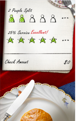
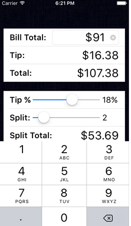
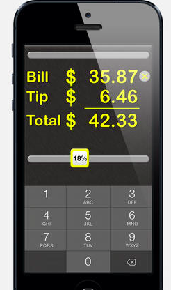
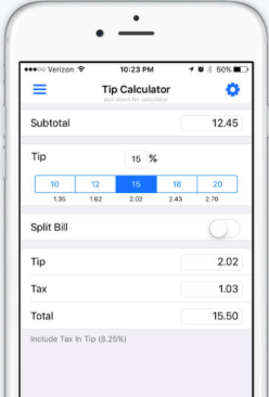
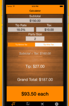
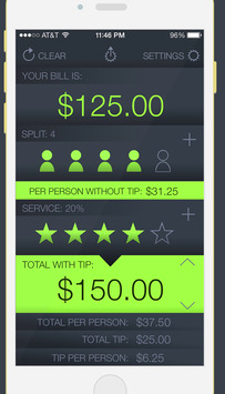
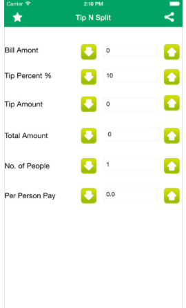
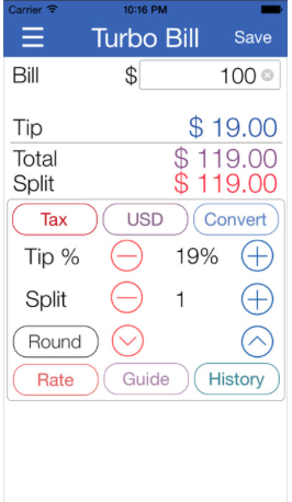
Below are screenshots from the current top search results for “tip calculator” in the App Store. They are all probably decent apps that work, but I’m posting them as a reference of what the current state of tip calculator apps looks like.

Screen Shot 2016-06-22 at 7.26.17 PM Screen Shot 2016-06-22 at 7.26.41 PM Screen Shot 2016-06-22 at 7.26.56 PM Screen Shot 2016-06-22 at 7.27.05 PM Screen Shot 2016-06-22 at 7.27.20 PM Screen Shot 2016-06-22 at 7.27.49 PM Screen Shot 2016-06-22 at 7.28.03 PM Screen Shot 2016-06-22 at 7.28.09 PM

Freeing up disk space as an iOS Developer

As an iOS Developer, I often have trouble updating to the latest version of Xcode since my 128GB MacBook Air keeps filling up.

Common culprits include ~/Library/Developer/Xcode/DerivedData and ~/Library/Developer/Xcode/iOS DeviceSupport.

By clearing out those two folders, I’m able to free up 11GB at this time of writing. For more information on what these folders contain, this [LINK REMOVED – see below] was helpful.

May 2021 Edit: This post previously linked to http://ajithrnayak.com/post/95441624221/xcode-users-can-free-up-space-on-your-mac. The link has been removed since the link is now broken.

Life Perspective

This post takes a more serious, rhetorical tone.

As someone in his 30’s, I’m going to repeat a cliché that I say a lot: time flies. It’s amazing how fast the years go by. You can choose to be a grown up and do grown up things (family, career, etc.), or you can choose to have less responsibilities (more freedom?); but time flies regardless.

One topic that has been weighing heavily on me is my time with family. The family that I’ve taken for granted. You may know what I’m talking about: parents, sibling(s) – the people that you saw all the time when you were a kid. The people that you spent all your time with doing mundane things like watching TV or eating a meal.

As a person living in a different region from my immediate childhood family, it feels really weird for me to see so little of them. The worst part is that even if I do see them, there is no real way to “make the time count”. How do you make your time count anyways? Time flies by and that day or week with them is in the distant past.

I’ve read an interesting piece, The Tail End by Tim Urban, that shares some of my sentiments. By not living near my parents or childhood friends, I’ve got very little % of the time left with them. I’ve already spent most of the time I’ll ever have with them (in the context of humans on Earth).

Urban brings up great takeaways:

1) Living in the same place as the people you love matters. I probably have 10X the time left with the people who live in my city as I do with the people who live somewhere else.

2) Priorities matter. Your remaining face time with any person depends largely on where that person falls on your list of life priorities. Make sure this list is set by you—not by unconscious inertia.

3) Quality time matters. If you’re in your last 10% of time with someone you love, keep that fact in the front of your mind when you’re with them and treat that time as what it actually is: precious.

The more I think about this topic, the more paralyzed I feel. Not in a literal sense, but more in a existential sense. How do I make the most of my time here?

To use a shoddy example: when I travel to a new place, I want to experience “all the things” and feel like I’ve done it all. Which is obviously impossible for any place that’s not super, super tiny. What I end up doing is walking around streets arbitrarily, take a bunch of bad pictures. This is a brute force / high level strategy to see a little of everything, but without any depth. I feel like I am not experiencing everything to its potential, and this feels like FOMO (fear of missing out).

I don’t have any satisfying answers to making the best use of our precious time. There is always a sense of FOMO in a world with endless choices. All I can do is prioritize between what I need to do and what I want to do. Everything else will be left behind, but that’s alright because ain’t nobody got time for that.

Dynamic Infinite UIPickerView Scrolling Example

In iOS, I’ve seen a lot of examples of creating a UIPickerView with a hardcoded array of strings. This may be necessary if your data set is a list of strings (such as USA states). For numbers, there’s a much easier way to dynamically generate each row’s title.

To start off with, here’s a simple, programmatic UIPickerView implementation that includes the numbers (as strings) 0 through 9:

import UIKit

class ViewController: UIViewController, UIPickerViewDelegate, UIPickerViewDataSource {

    override func viewDidLoad() {
        super.viewDidLoad()
        
        setupPicker()
    }

    var pickerView: UIPickerView = UIPickerView()
    var pickerDataSource = ["0", "1", "2", "3", "4", "5", "6", "7", "8", "9"]
    
    func setupPicker() {
        pickerView.dataSource = self
        pickerView.delegate = self
        
        pickerView.frame = CGRectMake(0, 0, view.frame.width, 300)
        view.addSubview(pickerView)
    }
    
    func pickerView(pickerView: UIPickerView, titleForRow row: Int, forComponent component: Int) -> String? {
        return pickerDataSource[row]
    }
    
    // columns count
    func numberOfComponentsInPickerView(pickerView: UIPickerView) -> Int {
        return 1
    }
    
    // rows count
    func pickerView(pickerView: UIPickerView, numberOfRowsInComponent component: Int) -> Int {
        return pickerDataSource.count
    }
}

The key piece is the pickerDataSource that gives us our data source. It is an array literal, and in a worst case programming scenario, one can imagine a very, very long hardcoded array of looping “0” – “9”. A long hardcoded array works, but is not optimal for many reasons.

The code above looks like this in the simulator:
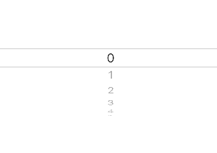
manual_ss

We can improve and change this in many ways. We are going to update the code to operate without using a hardcoded array literal. Also, the user has to scroll up (or down) for a very, very long time before they hit the end of the picker. When their scrolling stops, we will move the position of the selected row back to the middle, so that when they scroll again, there is a long way to go before they get to the top (or bottom).

import UIKit

class ViewController: UIViewController, UIPickerViewDelegate, UIPickerViewDataSource {
    
    var pickerView: UIPickerView = UIPickerView()
    let pickerDataSize = 100_000
    
    override func viewDidLoad() {
        super.viewDidLoad()
        
        setupPicker()
    }
    
    func setupPicker() {
        pickerView.dataSource = self
        pickerView.delegate = self
        
        pickerView.frame = CGRectMake(0, 0, view.frame.width, 300)
        view.addSubview(pickerView)
        
        // set the picker to the middle of the long list
        pickerView.selectRow(pickerDataSize/2, inComponent: 0, animated: false)
    }
    
    func pickerView(pickerView: UIPickerView, titleForRow row: Int, forComponent component: Int) -> String? {
        return String(row % 10)
    }
    
    func pickerView(pickerView: UIPickerView, didSelectRow row: Int, inComponent component: Int) {
        // do something with the resulting selected row
        
        // reset the picker to the middle of the long list
        let position = pickerDataSize/2 + row
        pickerView.selectRow(position, inComponent: 0, animated: false)
    }
    
    // columns count
    func numberOfComponentsInPickerView(pickerView: UIPickerView) -> Int {
        return 1
    }
    
    // rows count
    func pickerView(pickerView: UIPickerView, numberOfRowsInComponent component: Int) -> Int {
        return pickerDataSize
    }
}

In this 2nd code snippet for our ViewController, we have created a large number, pickerDataSize, that tells our device how many rows there are. The neat thing is that we don’t need to create an array of 100K items. When the UIPickerViewDelegate’s titleForRow method is called, it uses the row to dynamically return a string for that given row. Progress!

As a bonus, I went ahead and added a call to pickerView.selectRow in the didSelectRow function. When the user finishes selecting a row, this call will silently (animated: false) move the selected row back to the middle of the rows. This will maintain the illusion of infinite scrolling. Success!

Here we can see the updated, dynamic picker view:
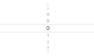
dynamic_ss

LA Commute Visualization

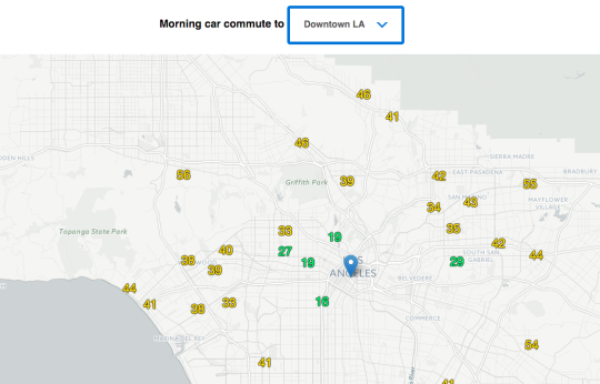
This month, I chose to visualize LA commutes. The data is visualized & published here:  http://xta.github.io/la_commute/

la_commute_ss

For the starting locations, I chose a mix based on highly populated areas and places of interest to me. I wanted to get a good distribution throughout the greater LA area. I realize that most people wouldn’t commute nearly two hours a day, but the sad reality is that people do have these long or even longer commutes.

For the destinations, I chose three popular, work-concentrated areas (Santa Monica, Century City, and Downtown Los Angeles). I realize that many people do not work in these 3 locations, but these locations help visualize a horizontal slice across central LA.

My workflow was running a local Ruby script multiple times a day throughout the past few weeks. I have both morning & evening commute data, but I think morning commutes are more interesting. I may be wrong, but I’m assuming that morning commutes are more consistent (people leave for work around 7 to 8am, and they leave work anywhere from 3 to 9pm).

Once I had the data, I loaded my csv file(s) into Google Sheets. With Google Sheets, I did basic sorting and aggregating of the commute times. I output my data in a specific format so that I could easily consume it with my JS code.

Loading the data into Leaflet.js markers wasn’t too bad. The hardest part was styling & displaying the commute data properly. Originally, I wanted to draw labelled lines between the different locations to the destination, but labelling lines appears to be really difficult with web map libraries. I also didn’t want to hide all the data behind a tooltip that had to be clicked.

Overall, I’m pleased with my basic workflow and the power of Leaflet.js. Collecting traffic data was the most difficult part.

Mapping library used is Leaflet.js. Map & map data are from OpenStreetMap contributors. Map tiles are from CartoDB.

Anger Driven Development

As a programmer, it’s nice to imagine perfect productivity conditions: many well defined, small units of work lined up. If the work at hand is clear and you have ample time to get into a flow, you expect to finish many things. Unfortunately, real life rarely works out that way.

Instead of picturing an ideal, efficient scenario, I want to talk about a less than ideal productivity method that manages to pop up every now and then: Anger Driven Development (ADD). ADD in this context might mean different things to different people.

What ADD means to me is that I’m working on a task, get frustrated, and then refuse to be beaten. Some of my more productive times have occurred when I was so pissed at the situation that I refused to throw in the towel. I will NOT be beaten by a machine. The power of human will can be indomitable at times.

While driven to extreme frustration at what started off as an “easy task”, it becomes man versus machine. Man does not want to give up. Man refuses to give up.

Even if I was tired or had other reasons to put the work off until later, Anger Driven Development does not give me the choice to stop. Like taking a hammer to a screw and forcing it in through sheer will power and brute force, Anger Driven Development can be messy. Anger Driven Development can’t stop, won’t stop.

The most amazing part of ADD (besides the task that is now completed) is the sense of triumph at the end. While it always feels good to be productive and get things done, there are few things like the joy of victory after ADD.

Anger Driven Development would never be my modus operandi, but it inadvertently has its place in my toolbox.

Travel Overhead

Traveling to new places is fun and exciting. This year, I visited amazing parts of Europe and Hawaii. I really enjoyed Santorini and Waikiki.

One thing that seems to get overlooked in trip planning is travel overhead. On paper, if you were to go to three countries in Europe, that looks great! You’re accomplishing so much by checking out so many places. The reality is that travel can impose a heavy, relative overhead cost between destinations if not properly managed.

For example, if you have a flight at 2pm, your schedule for the day looks something like:

  • 11 am – pack and check out of the hotel
  • 12 noon – travel to the airport early enough
  • 1 pm – wait at the airport gate
  • 2 pm – board the plane
  • 2:30 pm – fly to your destination
  • 3:30 pm – arrive and possible baggage claim
  • 4:30 pm – arrive at your hotel and check in

Your 2pm flight blocked over 5 hours of prime vacation time.

When traveling, I’ve found that the daytime is the prime time to do things. Whether eating food, going shopping, or hitting the outdoors – you’ll want to do it when it’s actually open and the sun is still out. If you have a 2pm flight, chances are that you’ve used up most of your day’s prime hours, which means one less day of vacation you actually get.

Even without worrying about airport flights, staying at different hotels in the same area can really impact your trip. Coordinating your check out time (or late check out time) with travel time to the next hotel can be tricky. Not to mention finding time to grab lunch.

While those who travel much more than me have internalized all of this overhead stuff, I’m getting exposed to it and it frustrates me. Spending prime vacation time lugging bags around and waiting for a bus/plane is a huge waste and should be avoided (planned around) if possible.

iTunes Payments Dropdown Tip

A quick tip about iTunes Payments and Financial Reports in iTunes Connect.

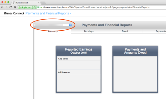
I was trying to reconcile from iAd Revenue to iTunes Payments. It looked like there were amounts missing in the Payments page. It took me a long time to realize this, but there is a dropdown to switch between your organization payment accounts. I probably have multiple payment accounts in iTunes Connect due to updating my address.

If you have multiple iTunes Connect agreements or accounts, you may want to check for a dropdown on the Summary page. I hope this helps someone out there trying to understand this part of iTunes Connect better.

itc_pmts