Category Archives: Tech

Camera Design

This is what constitutes popular (good?) camera design today:

Olympus E-P1 digital pen

An obvious design throwback to the days of film cameras, but not very imaginative.

I’m of the firm belief that camera design as we know it today has tremendous room for change. Take the micro 4/3 standard that is mirrorless.  It’s what enables the E-P1 above to be significantly slimmer than a traditional DSLR and retain interchangeable lenses. Going slimmer is just one possible direction.

Below are some camera concepts that break away from “the standard camera” look (think Leica).

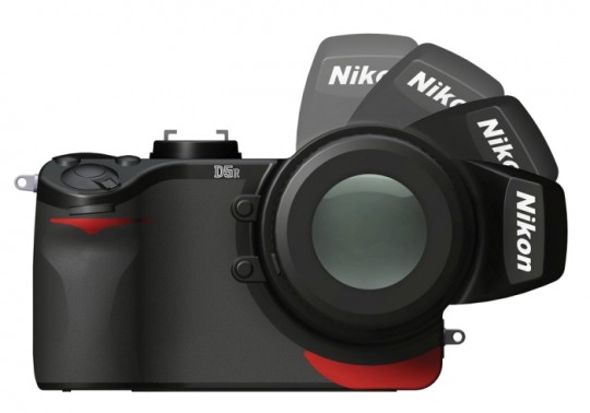
D5R Concept by Ned Mulka

This is a neat concept, but not super practical. Why go through all that body change without a number of obvious benefits? Still, +1 for daring to make a camera body that doesn’t conform to legacy design.

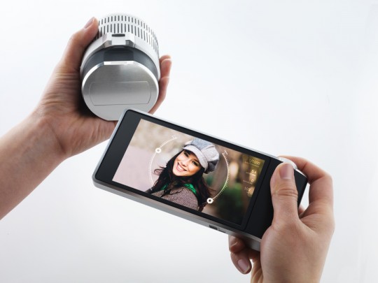
WVIL Concept by Artefact

The WVIL concept excites me a lot more. I think the future of professional cameras may involve wireless lenses syncing to a generic touchscreen (think Android phone, iPhone, iPod Touch, or iPad). The WVIL concept is great, but why reinvent the wheel with a proprietary touchscreen when an off-the-shelf generic touchscreen suffices?

I can easily envision a world where a professional photographer has many wireless lenses (perhaps with a gorilla pod each) that are all controlled by a single iPad remotely. All a person would have to do is set up multiple wireless lenses before a sporting event starts. During the event, the lenses would (since this is the future we’re talking about) take continuous ultra high-definition video. The touchscreen controller would be used to monitor focus and other settings.

iPhone 4

Another trend in camera hardware is the disappearance of noticeable hardware. With smartphones packing incredibly better cameras (as in “decent enough”), it’s possible to get high quality photos without carrying around a point and shoot. The trend of nearly invisible camera hardware will only get better as phone cameras improve.

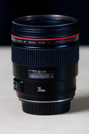
Team EF Lens Mount

via flickr @kevinv033

Bloomberg:

In the market for cameras with interchangeable lens, or single lens reflex cameras, Canon controlled 44.5 percent of the market, followed by Nikon with 29.8 percent and Sony with 11.9 percent, according to the data.

The good news is that Canon is #winning, even if Apple is really winning?

The bad news is that prices are going up:

There’s lots of reports of price increases across the globe. This was bound to happen as retailers were and are still unsure what stock levels are going to be like.

Foursquare Check-in Places Default Sort

Foursquare is a great service to keep track of places I’ve been.

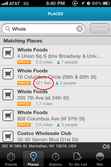
In the screenshot below, the closest location (521 ft) should be the first result. As I scroll down, I’d expect to find places further away.

Check-in Places Search Results

The concept of the service is to check-in to the place you are currently at. The search results should default to show closest locations at the top.

In the above screenshot, this isn’t an issue with only four Whole Foods to choose from. Imagine trying to find the right Chipotle location among dozens when the list is not sorted by closest geographical match.

Doing Business 101

Excellent, lengthy presentation from Mike_FTW about doing business as a freelancer designer (via Zeldman). This applies to any field, especially startups. I am not a lawyer, nothing here is legal advice.

2011/03 Mike Monteiro | F*ck You. Pay Me. from SanFrancisco/CreativeMornings on Vimeo.

TL;DR:

Get a contract in place before you perform any work that is reviewed by your own lawyer. Contracts are in place to benefit both parties and remove uncertainty.

Updated Free Kindle Forecast

The Kindle is now available for $114 with Special Offers (aka advertising).

Based on prior charts, I created an updated forecast:

The idea of the free Kindle explained by Kevin Kelly:

Since then I’ve mentioned this forecast to all kinds of folks. In August, 2010 I had the chance to point it out to Jeff Bezos, CEO of Amazon. He merely smiled and said, “Oh, you noticed that!” And then smiled again.

It is interesting that the forecasted free Kindle date is slipping. (Forecasted to be free after June 2011, then forecasted for after November 2011.)

Google Reader API?

I’m surprised in this day and age where iOS only apps have their own API that a longstanding service like Google Reader doesn’t have an API. Apparently an API has been coming soon since 2005.

This is probably because idiots think RSS is dead. Not friendly to the mainstream user? Sure. Dead? No, not when every blog comes with a RSS feed.

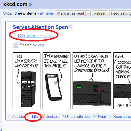
Google Reader Like function screenshot

It would be neat to play around with the Like function in an API. For example, a blogger may want to reach out to those who RSS subscribe & like their posts. It would be harder to find a more engaged power user (given that users have to 1.) Use Google Reader, 2.) Add your feed, 3.) Read your posts, and 4.) Click like).

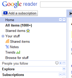
Google Reader navigation screenshot

The current Google Reader navigation is a poor mish-mash of social function bolted onto a best of breed RSS reader.

Consider what each of the items in the navigation section do:

  1. Home – A
  2. All Items – B
  3. Starred Items – C
  4. Your Stuff – D
  5. Shared Items – D
  6. Notes – D
  7. Trends – E
  8. Browse for stuff – A
  9. People you follow – F
  10. Explore – A
  11. Subscriptions – B

This can be boiled down to:

  1. A – Find new feeds.
  2. B – View unread feeds. Note that All Items is the default google.com/reader view, which works out well.
  3. C – Star items for later.
  4. D – Your shared items by granularity.
  5. E – Pretty stats page.
  6. F – Shared content by friends.

I would revamp the navigation to:

  1. A – Find new feeds. However Google wants to introduce you to new feeds, it can’t possibly take more than one page.
  2. D – Shared Items. I don’t distinguish between Shared Items and Notes. The actual distinction is that the former is via Google Reader sharing and the latter is via a bookmarklet type function.
  3. C – Starred Items. Keep this one as is.
  4. B,F – All Subscriptions. The “Subscriptions” text should show all subscriptions. Currently, the Subscriptions text reloads your subscriptions. Reloading subscriptions should be a refresh icon that everyone is familiar with. Then, I would make a folder under Subscriptions for People you follow items.

I wouldn’t mind losing the Trends (or stats) page since it caps out at 300K read items and 30 day trending.

iPad 2 Rumors: Don’t Hate The Player, Hate The Game

With the iPad 2 announced this week, the actual product is anticlimactic. If the first iPad had the iPad 2’s specifications, nobody would have been surprised. Don’t get me wrong, the iPad is an extremely strong offering that is dominating the market that it set off.

The tech industry covering Apple never ceases to amaze. Some companies have rumor sites, but Apple has a blog dedicated to sleuthing their patent filings. Apple rumors even lead to controlled leaks and allegations of leaks.

That said, Engadget needs to stop hating the player (Apple) and hate the game (internet as a pageview driven rumormill).

Here’s what a recent post says at the end:

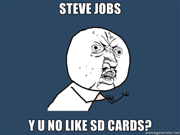
… which in turns gives you no reason whatsoever to turn down the opportunity. Except for the lack of a USB port, SD card slot and a screen that touts the exact same resolution as the first model, of course.

Why would anyone have expected a USB port, SD card slot, or some sort of Retina display? Oh right, Engadget claimed these were coming in an exclusive scoop.

Rumors are just that, right? Well, they decided to double down on their source and blame Apple for removing the USB / SD / high res screen at the last minute.


Updated Amazon Product Image Zoom

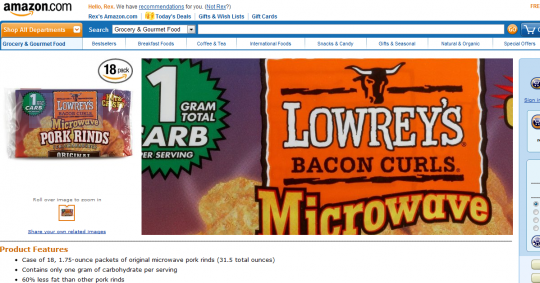
While Mousing Over Product Image

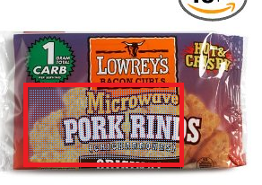
While surfing Amazon via slickdeals today, I noticed this updated product image zoom technique on Amazon. Not sure if this technique is necessary, but on the surface it seems a net improvement in utility for Amazon’s customers.

Before Mouse Over of Image

Before mousing over the product image (seen on the left), this product page looks like any other product page on Amazon.

The Zoomed Selector Range

While you mouse over the product image, you see a blue dot texture indicating what part of the product image you are zooming into.

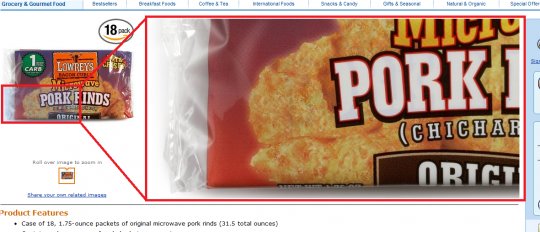
Mouse Over of Product Image

Mousing over the bottom left corner replaces the product description section with a corresponding bottom left product zoom.

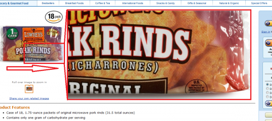
Product Image Mouse Tracks to the Right

As you move your mouse to the right of the product image, you can see that the product zoom tracks accordingly.

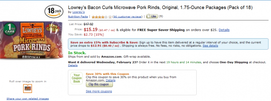
Product Page without Mouse Over

Once your mouse leaves the product image on the left, the screen returns to normal. You can now see the product description again.

Regarding when this update was rolled out or what browsers this works in, I don’t have definitive answers. I noticed this product image zoom update today while using Chrome at the product page.

As for its conversion rate, I did not buy the product. Either their internal testing shows an increase in purchases with this rollout or I got put into a testing sample. I could see this product image zoom technique become useful for products with hard to read text (such as food ingredient labels).

Foursquare Hackathon

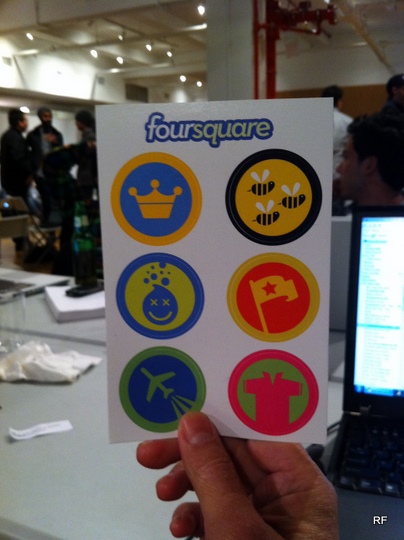
Badge Stickers

Just got back from a very fun Foursquare Hackathon. Contrary to some opinion, there was a lot of hacking done. 40 projects are on the wiki at the time of writing. Hail to the Mayor is particularly intriguing one since the idea is that when the mayor (or other specified person) checks in to a venue, their theme song would play.

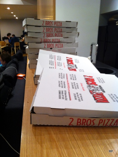
2 Bros Pizza

Note: the piping hot 2 Bros Pizza was delicious (as is all free pizza). After 10 minutes, the pizza cooled down and was pretty stale/terrible.

This sign means good things are inside

There was nonstop networking/socializing, but this is a good, healthy thing for the NYC startup scene.

General Assembly hallway

One thing that I noticed was how most teams focused on the tech hacking (as they should at a hackathon). This typically resulted in awkward or less polished demos. The demos were limited to 60 seconds of presentation with immediate judge feedback afterwards. To me, this looked like teams were rewarded for slick UI while the backend (no matter how good or bad) didn’t count for as much.

Naveen speaking during the demo session

For those who couldn’t make it tonight, good news: Naveen mentioned he wants to expand 4sq hackathons internationally.

Real Life Facebook Button

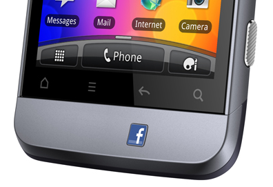
A dedicated button for Facebook on your phone? With super awkward placement?

While this Fb x Real Life mashup is unnecessary, I wanted to look at other examples of company logos on real life buttons. Most companies that produce hardware are content with having their logo printed onto a surface instead of a pushable button.

Note: images are used only to illustrate hardware buttons. Each logo is property of their respective owner.

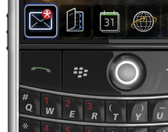
Blackberry has been doing this for some time. Note the natural location among the keys.

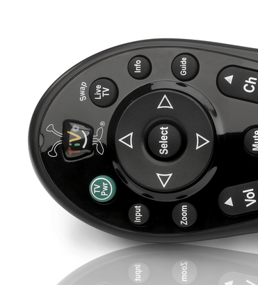
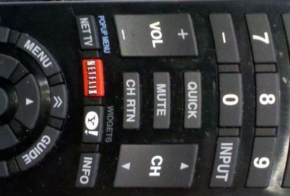
A natural category for buttons is remotes. Specifically TV remote controls.

TiVo has been doing this for a while with their quirky logo.

Netflix is rolling out their logo as more and more devices ship with an embedded Netflix app. Apparently, Yahoo got onto this remote as a bonus.

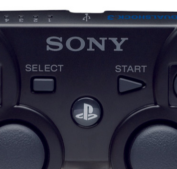
Another category with branded buttons is video game consoles. Their controllers have gained logo buttons with the current generation of hardware.

The original Xbox had a giant logo, but it wasn’t one you could press. The Xbox 360 has a pushable logo for Xbox’s dashboard.

Playstation 3 getting its logo on.

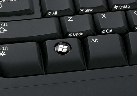
An easily overlooked category would be the keyboard. Countless keyboards have the Windows logo.

Here is an example of the ubiquitous Windows keyboards that exist. The Windows key is useful for certain shortcuts (Win + D for desktop), but a pain when you’re in the middle of a full screen game.

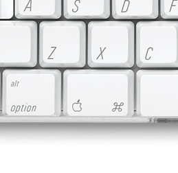
Some Mac keyboards have an Apple logo.

While the Facebook logo above is placed awkwardly for dramatic effect, most company logos are placed logically in a manner that consumers use every day.