Category Archives: Tech

Google Chelsea Free Wi-Fi: Mapped

Google is notorious for providing their employees free lunch.

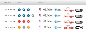
Beginning today, certain Chelsea MTA subway stops have free Wi-FI.

Per Transit Wireless (the company Google teamed up with to offer the Wi-Fi), the following locations have Wi-Fi:

Let’s looked at these MTA stops mapped along with Google’s NYC headquarters:

Probably not a coincidence that these stops are the only MTA ones near Google.

Excel Format Painter: Double Click Hot Tip

Format Painter in Excel 2003

For all those who live in MS Excel (myself included), here’s a nifty tip paraphrased from AccountingWeb:

Double Click the Format Painter to lock the Format Painter. Paste the format into as many cells as you want then hit the Escape Key.

When I found out about the Format Painter several years ago, my mind was blown. It’s one of those small things that once you learn, it becomes essential. This tip lets you paste the cell formatting into as many cells as you want without having to go back and click the Format Painter icon before each paste.

I’ve tried double clicking on Format Painter in both Excel 2003 and newer versions (2007 I think), and it works.

It’s the details that count.

The Man in the Arena

Posting this bit by Theodore Roosevelt so that I can find it easily. It’s not a new quote (it dates back to 1910), but it’s so true. Critics are just that.

It is not the critic who counts; not the man who points out how the strong man stumbles, or where the doer of deeds could have done them better. The credit belongs to the man who is actually in the arena, whose face is marred by dust and sweat and blood; who strives valiantly; who errs, who comes short again and again, because there is no effort without error and shortcoming; but who does actually strive to do the deeds; who knows great enthusiasms, the great devotions; who spends himself in a worthy cause; who at the best knows in the end the triumph of high achievement, and who at the worst, if he fails, at least fails while daring greatly, so that his place shall never be with those cold and timid souls who neither know victory nor defeat.

Learning Regex The Hard Way

I want to do both the Regex & Ruby tutorials in Learning the hard way series. C’mon, Regex is just super useful.

Just installed Python, pip, distribute, and Regetron. (I’ve spent most of my time learning Ruby, no Python before).

It wasn’t so bad using Homebrew and googling for error messages. This guide was helpful for me to setup Homebrew & Rails on OSX, but I’m still using bash.

For Python, I simply ran brew install python3

As Python finished, I got a message that “Distribute has been installed, so easy_install is available.”

Okay, so let’s try easy_install pip

I get unfriendly error messages:

error: can’t create or remove files in install directory

The following error occurred while trying to add or remove files in the
installation directory:

[Errno 13] Permission denied: ‘/Library/Python/2.7/site-packages/test-easy-install-42140.write-test’

The installation directory you specified (via –install-dir, –prefix, or
the distutils default setting) was:

/Library/Python/2.7/site-packages/

Perhaps your account does not have write access to this directory? If the
installation directory is a system-owned directory, you may need to sign in
as the administrator or “root” account. If you do not have administrative
access to this machine, you may wish to choose a different installation
directory, preferably one that is listed in your PYTHONPATH environment
variable.

For information on other options, you may wish to consult the
documentation at:

http://peak.telecommunity.com/EasyInstall.html

Please make the appropriate changes for your system and try again.

After googling to no real obvious answer, I simply ran sudo easy_install pip

It works!

Then for distribute & Regetron, it was the same thing (I had to use sudo). sudo pip install distribute works. I tried to run pip install regetron, but I had to use sudo pip install regetron instead.

iOS Redeem App Code Mockup

New rule: if I have to google “how to [do something],” your UI needs improvement.

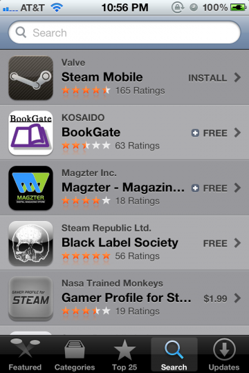
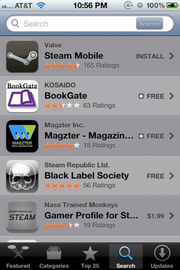
While redeeming an iOS app, I couldn’t figure out where to enter in the app code. I instinctively went to the Search section, as I know that has a text input section at the top:

iPhone App Store Search screen

No dice.

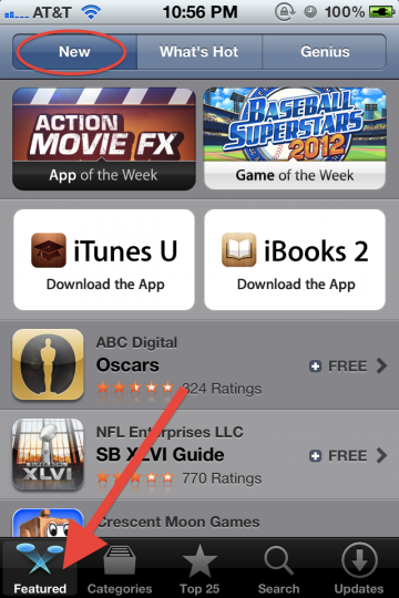
So as with everything in modern life, I went to Google for help. It turns out it’s at the bottom of the Featured screen.

iPhone App Store Featured screen top

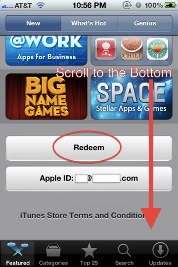
Scrolling down…

iPhone App Store Featured screen bottom

I find the Redeem button, and the rest is cake.

Without googling, I wouldn’t have stumbled upon Featured > New > page bottom to find the Redeem button.

I recognize that for most people, redeeming an app code is not a typical, common use case. That said, it should be somewhere logical. I’ve mocked up the Search screen with a Redeem button:

iPhone App Store Search screen mockup

This way, the user is able to associate entering in names of apps, keywords, or app codes in one convenient field.

The upside is an extremely easy to find Redeem button. A possible downside is that users will get led astray while searching for paid apps (by hunting for app codes instead of proceeding to checkout).

With Sites as Apps, Apps as Sites

From the one and only, Jeffrey Zeldman:

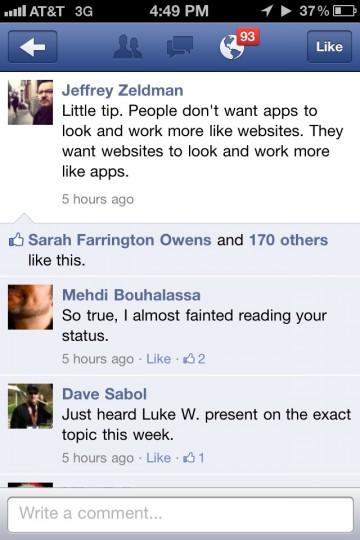
Zeldman Facebook iPhone screenshot

Zeldman says:

Little tip. People don’t want apps to look and work more like websites. They want websites to look and work more like apps.

My gut reaction to this insight is mixed.

On one hand, many new websites are in essence single serving apps. They have no more functionality than extremely niche smartphone apps. On the other hand, websites are visually distinct from apps. What I mean is, sites have been apps for a while now, but they don’t look exactly like smartphone apps. Even with responsive design, sites simply don’t use smartphone title bars and buttons.

Would the average user prefer simple smartphone app UI over tried and true website navigation metaphors? This could be the tradeoff between vertical-scrolling, hierarchical panes VS complex, kitchen sink pages.

Free Online CS Courses Taught by Stanford Faculty Q1 2012

Free Online Courses

I’m currently taking the free Intro to Databases course taught by the excellent Professor Widom. The course consists of video lectures with homework exercises, quizzes and midterms. There is also a helpful Q&A forum for students when you get stuck.

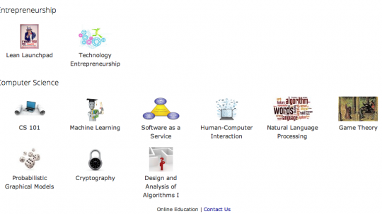
In the beginning of 2012, there are more free online courses available, including:

The classes are high quality and perfect for you if you can spend more than a few hours a week per course. As they are free, the courses don’t offer any official Stanford certificates, grades, or credit. You do get a Statement of Accomplishment from the instructor.

I’d recommend these courses to anyone as they are free, and any investment in your time will be easily rewarded with an understanding in increasingly relevant present-future topics.

Apple Keyboard Shortcuts

We get it. Apple is the company that pays attention to the details. No detail too small, they create their own reality. With a strong internal design culture, they provide customers what they want before they ask for it. But sometimes they misfire (such as their power cords).

I recently started using OS X Lion. Spotlight (command + space) is amazing. Hot corners are cool. The difference between switching applications (command + tab), switching windows (command + `), and switching tabs (control + tab) sucks.

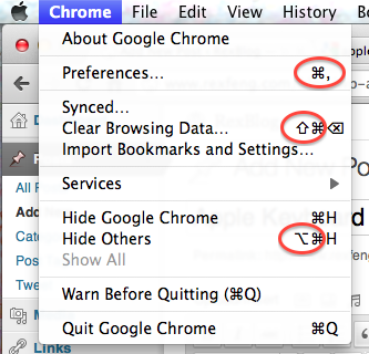
Looking at OS X’s menu bar, how would you ever figure out that that a sloping line with a horizontal line indicates the option key?

Menu Bar example (top to bottom: command, shift, and option)

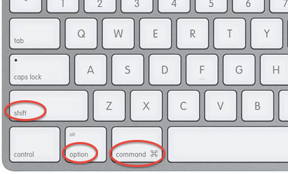
The command key is clearly labelled on the keyboard. Not sure how you would easily describe the command key symbol’s shape over the phone.

The shift (the up arrow circled above) and the delete key (not circled) can be deduced by your average power user, so I’ll give Apple a pass.

The option symbol, which I’m still not sure how to easily describe (the bottom circled symbol) is a mystery.

Here is what an Apple keyboard looks like:

Apple Keyboard (from left to right: shift, option, and command)

While Apple is known for their attention to detail, the usage of the option symbol to indicate keyboard shortcuts in the menubar is useless as the option symbol only makes itself evident through 1.) web searching or 2.) consulting an expert Mac user. It doesn’t have to be this way. The easiest solution would be for Apple to print the symbol of the option symbol onto the keyboard.

Former Google Reader PM on the Update

A take on the Google Reader update from former Google Reader Project Manager, Brian Shih:

Google released the previously announced set of changes around G+ integration and UI updates today, and boy is it a disaster.

He continues on visuals:

Taking the UI paradigm for G+ and mashing it onto Reader without any apparent regard for the underlying function is awful and it shows.

His take on Google+ integration:

Ok, before we get started – let me be very clear about one thing. I think integration with G+ should happen. Reader friends should be managed in the same place you manage G+, with the same metaphors (whether you think they’re flawed or not). Sharing should utilize the same infrastructure and plumbing that G+ does. I am not objecting to any of these things. Google has clearly made its bets with G+, and Reader should be part of those plans.

I find his views on the money. Google has every right to integrate Google+, but why do they trash the sharing functionality of Google Reader in the process? I understand that Google is trying to focus, even though it conflicts with their release-everything-as-a-beta-product DNA.

My discontent with the new Reader lies in the sharing workflow. It’s too many steps, as Brian explains:

But the new sharing flow around the +1 button has actually made it harder to share. Where you used to be able to click one button, or hit shift-s to one-click share to your audience, you now need to:

  1. Click +1 (no keyboard shortcuts for you)
  2. Click the text box that appears that says “Share to G+”
  3. Then choose your circle you want to share to (or let it default to public)
  4. Then click Share

Keep in mind that on top of requiring 3-4 times as many clicks, you also now must +1 a post publicly to share it, even if it’s shared to a private circle. That bears repeating. The next time you want to share some sexy halloween costumes with your private set of friends, you first must publicly +1 the post, which means it shows up on your profile, plus wherever the hell G+ decides to use +1 data. So much for building a network around privacy controls.

When Reader updated, I said the same message:

 Google, please separate the steps of explicitly approving content (+1) and sharing content among friends (sharing to Circles). Just place “Share to Circle(s)” between “+1″ and “Email” under each Google Reader content piece.

While I didn’t spell out the new workflow as Brian did, I was talking about the same issue. Why does Reader make you +1 content that you don’t necessarily want to +1 before you are allowed to share? Why does Reader make you take at least 3 steps now compared to 1 step (hitting shift+S) before?

Luckily, there is a non-intuitive solution if you want to share Reader content to Google+ Circles. Brian shares:

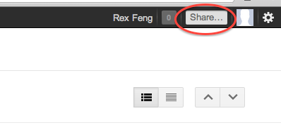
If you click on the top right “Share…” field on the OneGoogle bar, you can bypass the +1 button. It’s just completely undiscoverable.

Ultimately, Google has every right to change Reader as it sees fit. Google provides Reader as a free product to users who derive some benefit. Google wants to align its products toward its bottom line, so they made Google+ the de facto sharing system of Reader. That said, users just want to 1.) read news & 2.) share content. It’s a shame that this latest update made #2 a bloated process.

(via googlesystem)

Google Reader +1 Change: This is all your fault Facebook

This post is all semantics and concerns Google Reader. Knowing fully well that most people have never heard of Google Reader (this guy uses it), allow me to rant.

Once upon a time, Facebook rolled out the Like button. It was widely adopted across the web.

Facebook Like Button

Facebook defines the like button as:

The Like button lets a user share your content with friends on Facebook. When the user clicks the Like button on your site, a story appears in the user’s friends’ News Feed with a link back to your website.

In the definition, there is no explicit indication that the Facebook user approves/enjoys/etc. the content shared. But as anyone who speaks English will tell you, Liking something indicates that you find the content shared agreeable.

Not surprisingly, this has led to countless occasions where Facebook users have ‘Liked’ content that they do not (in plain English) like. See this bit about AT&T users on Facebook.
Updated Google Reader Screenshot

Today, Google rolled out their Google Reader update.

Before today’s update, you could Star, Like, Share, Share with note, Email, Keep Unread, and Tag Google Reader content. Those are each separate, independent actions:

Google Reader - Before Update Actions

Google defines sharing content as:

When you find interesting items on Reader, you can choose to share them on Google+ publicly, or with a certain circles or friends. You can also add a comment in the sharebox to your shared items. Your comment will show up along with the item you’ve recommended in the streams of those you’ve shared with.

Today, you can Star, +1, Email, Keep Unread, or Tag Google Reader content:

Google Reader - Updated Actions

I’m OK with this except for one workflow detail. Before you can share any Google Reader item, you need to first +1 it.

Google explains that +1 means:

+1 gets conversations going. Click the +1 button to give something your public stamp of approval. Then, if you want to share right away, add a comment and send it to the right circles on Google+.

Their Reader blog says:

The ability to +1 a feed item (replacing “Like”), with an option to then share it with your circles on Google+ (replacing “Share” and “Share with Note”).

The Google Reader update makes you give your “stamp of approval” on content before you can share it with friends. With content on the internet, there is plausibly content that you want to share (because you find it interesting) but do not approve of. For me, the Google Reader content that I Like (in the broadest sense of enjoying and approving of content) is a small subset of content that I Share. But interesting content (shared) & approved content (liked) don’t need to intersect.

Google has a superior system in place. By that, I mean that +1 & sharing to Circles are two distinct actions in Google+ VS the conflated Like action in Facebook. Google, please separate the steps of explicitly approving content (+1) and sharing content among friends (sharing to Circles). Just place “Share to Circle(s)” between “+1” and “Email” under each Google Reader content piece.


Update 11/10/11: Share has been added.