Brooks Brothers: Cutting to the Chase
I don’t do a lot of online clothes shopping, so I apologize if this is the norm. I suspect it isn’t the default.
There’s a current sale (May 9-12, 2012) at Brooks Brothers, and their Non-Iron dress shirts are pretty nifty.
Once you go to their site, it looks like this:
[caption id=“attachment_1541” align=“alignnone” width=“540” caption=“Brooks Brothers website sales page Screenshot”]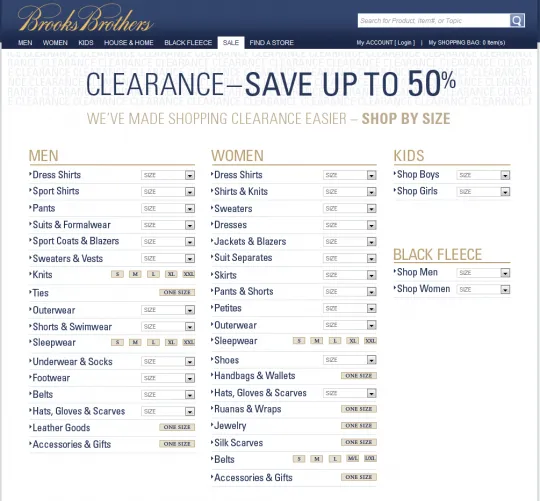 [/caption]
Not the prettiest page you’ve ever seen, but it cuts to the chase. This lets you only search for clothes in stock that’s your size. Brilliant! I could care less if there’s a $200 item marked down to $8 if it’s size XXL.
After selecting a size, you’re taken to a page where you don’t have to choose between View 15 per page OR View 25 per page OR View 50 per page.
[caption id=“attachment_1542” align=“alignnone” width=“540” caption=“Shirts Search Results page Screenshot”]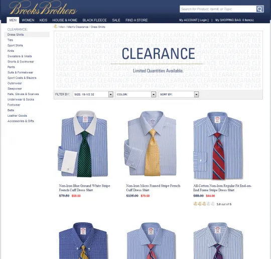 [/caption]
For my search, it shows all results on one page since bandwidth in 2012 America isn’t as much as problem as dial up 10 years ago.
UI/UX/design isn’t about looking pretty. It’s about having something that’s simple/easy/intuitive to use and gets the task done. In this case, I was able to search only the relevant sized dress shirts, add to cart, and checkout (without creating a user account) quickly.