We get it. Apple is the company that pays attention to the details. No detail too small, they create their own reality. With a strong internal design culture, they provide customers what they want before they ask for it. But sometimes they misfire (such as their power cords).
I recently started using OS X Lion. Spotlight (command + space) is amazing. Hot corners are cool. The difference between switching applications (command + tab), switching windows (command + `), and switching tabs (control + tab) sucks.
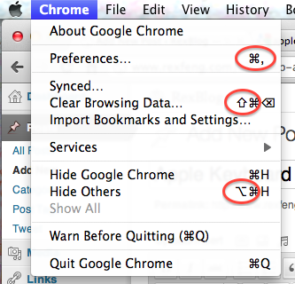
Looking at OS X’s menu bar, how would you ever figure out that that a sloping line with a horizontal line indicates the option key?

Menu Bar example (top to bottom: command, shift, and option)
The command key is clearly labelled on the keyboard. Not sure how you would easily describe the command key symbol’s shape over the phone.
The shift (the up arrow circled above) and the delete key (not circled) can be deduced by your average power user, so I’ll give Apple a pass.
The option symbol, which I’m still not sure how to easily describe (the bottom circled symbol) is a mystery.
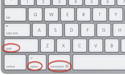
Here is what an Apple keyboard looks like:

Apple Keyboard (from left to right: shift, option, and command)
While Apple is known for their attention to detail, the usage of the option symbol to indicate keyboard shortcuts in the menubar is useless as the option symbol only makes itself evident through 1.) web searching or 2.) consulting an expert Mac user. It doesn’t have to be this way. The easiest solution would be for Apple to print the symbol of the option symbol onto the keyboard.